Chapter 3
How to create a user persona template + examples
In this chapter, we’re covering how to build user persona templates to use in your UX process. Plus, get some of our favorite game-changing user persona templates to inspire your own.
TL;DR
User persona templates work best when they're simple, research-driven, and built for teams beyond UX. When you’re creating a persona template, focus on user goals, pain points, behaviors, and values. Use consistent layouts so teams can compare personas at a glance, and design with UX principles like proximity and hierarchy to improve readability. Persona workshops and flexible tools like Miro or Notion help teams co-create and refine personas over time.
Congrats, you made it—this is the final chapter in our four-part user persona guide. We started by explaining user personas and their benefits, moved on to how to build UX personas, and then provided details on persona mapping.
To close out the guide, we’re running you through user persona templates and how you can develop your own. Plus, Brand Experience Designer, Ash Oliver, shares some tips for creating your template, and we finish off with a ready-to-go template for you to use.
Here’s some key info and top tips from Ash before we dive in:
- Personas are a composite sketch of a key segment within your users
- The best personas are created through research—a combo of data and educated guesses
- Context helps frame the understanding—the more context, the broader the picture we can illuminate
- The more diversity you have within your user persona creation team, the more lenses you can apply to your information
- Make your user personas memorable
So, that’s what we've got so far—let’s dive into our fourth and final chapter.
Shall we?
What makes a user persona template great?
A user persona template is a tool for representing and summarizing a target audience for your product or service. A strong user persona template can help you map out your customer's thoughts and feelings, and provide valuable insights for teams across your organization.
There are plenty of user template designs to choose from—let’s take a look at how you can ensure yours is spot on.
They’re representative and easy to understand
Personas are represented by one profile, but they don’t reflect the thoughts and feelings of only one user. You want your user persona template to provide sufficient sections to adequately represent a major user group.
When creating user personas, you want to avoid being too niche. Don’t create persona templates that require you to fit a certain box—make space for all key sections.
It’s also important to consider that your user persona needs to be communicated with a variety of teams, not just the UX team—user personas are used across your organization, and not everyone who uses them was involved in their creation. Your user personas need to be understood by people who know nothing about them.
Ash shared some tips on how to encourage company-wide adoption of personas:
The user persona templates that are successful are the ones that anchor the persona to something within the company. It doesn’t just include a random stock image and stock name. They set the foundation for more interest from your internal users.

Ash Oliver
Brand Experience Designer & Founder at Foster
Share
You want to focus on ensuring your user persona template is simple for everyone—not just those who created it.
They’re built based on research
When putting together your UX persona templates, you want to ensure you’re building them with comprehensive research at the core. Here’s what Ash had to say on researching for your user persona template:
“I try to think about personas as a snapshot of a certain section of users. Within that, there’s then going to be different personas for different teams. Ultimately, your personas are a blueprint for you to build your product on, but the product needs to resonate with the real user.
The most successful personas are created through research, data and educated guesses. They’re creative and tell stories to enable designers to think about the product through a different lens.”
Your research should inform your user persona template, not the other way around. Once you know the key information you want to include, building different user persona templates is a breeze.
They’re dynamic documents
User persona templates don’t need to be one, static document—you can do way more when thinking bigger. Take it from Ash:
Personas can come from a workshop or something more fluid. The best persona artifacts are the ones that move past the singular templates. They’re a great starting point but there’s no end point.

Ash Oliver
Brand Experience Designer & Founder at Foster
Share
Don’t stop at templates—run user persona workshops for a deeper learning opportunity. Invite different team members to take part and really drive home the amount of effort and research that’s gone into creating your user personas.
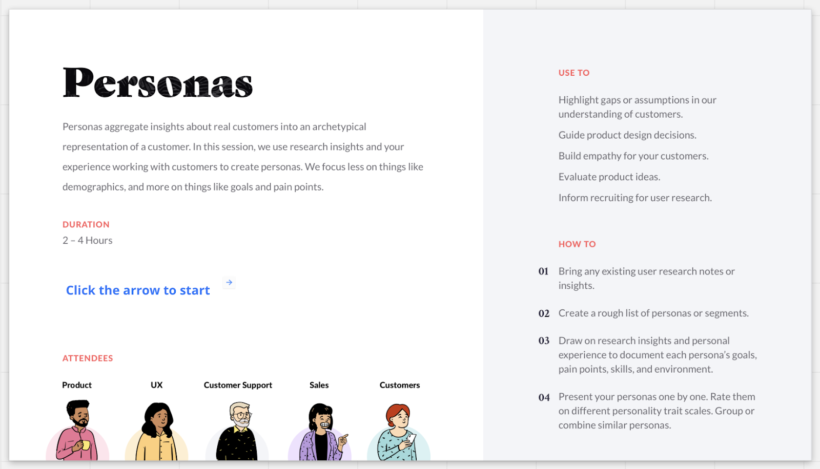
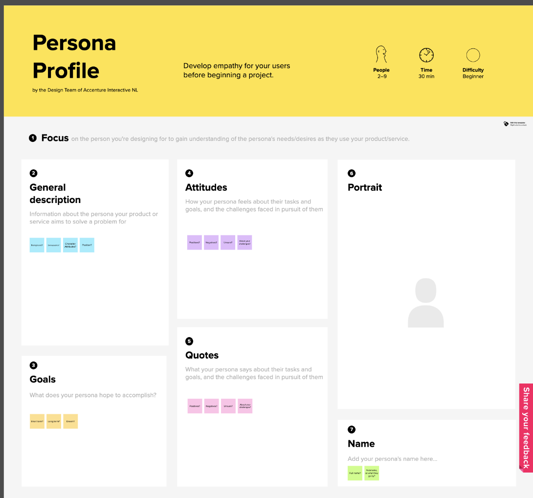
Miro offers a template that helps you do just that.
This template involves a variety of teams in the user persona development and communication process, and enables you to get everybody on the same page when it comes to user personas and their applications.
A persona workshop is a fantastic way to develop your personas beyond a filled-out template, and is a great way to test out the effectiveness of your templates before putting them in action.
They help communicate universal features
Your user persona templates should enable you to identify key considerations and overlap in your personas.
Your user personas pass through many different teams who consider different business aspects—important information needs to be easily identifiable. One way to do this is to ensure your user persona templates are identical in design, with only the information changing between personas. That way, when they’re being put into action, teams can easily identify quick-wins and key areas for improvement.
For example, if the product team identifies an area that multiple personas are interested in—they can prioritize updates in that area. If the marketing team can easily see where most of the target users spend their time online—they can quickly and easily pivot to place more emphasis on that platform.
Having all your key data in an easy-to-understand template enables more efficient identification of areas for improvement. It can also help you locate any important product features that users across the board love.
You can then use this information to make better product, marketing, and sales decisions—alongside the improvement you’ll be making to overall UX.
They avoid highlighting demographics
You don’t need to include demographic information in your personas—unless absolutely necessary. We expanded on this in chapter one, but essentially, you want to prioritize feelings, thoughts and personality traits over demographics. Put simply, you’re wasting space specifying where your user persona is from.
Of course, you want to tell a story with your persona. In fact, it’s essential—but you don’t need demographics to create detailed personas. You can create just as much impact by focusing on what your users feel and think over their age and gender.
Demographics often create the opportunity for bias, which should be avoided at all costs. User personas shouldn’t lead to assumptions—they’re built on research and educated guesses. The information that’s relevant should already be included in your personas—don’t make space for teams to jump to conclusions.
They implement UX principles of design
Like any other design—you want your user personas to be attention-grabbing and easy-to-understand. Ensuring you’re considering the many principles of UX design is a big must.
Your principle aim is to meet the users’ needs—when it comes to personas, this is a double-pronged approach:
- You’re looking to create personas that highlight what your users want and need. The sections you include dictate how well this goes.
- You’re looking to create personas that the entire organization can understand.
You need to make sure your personas are both fit for use and easy to communicate. Hitting one but not the other means your personas aren’t doing their job—and you won’t be able to either.
Some other common principles of design to consider including are:
- Gestalt’s principles of design: Improve the aesthetics and functionality of your design through six ideas—similarity, continuation, closure, proximity, figure/ground, and symmetry & order.
- Visual hierarchy: Refers to guiding the eye on the page so that it attends to different design elements in the order of their importance.
- Balance: Refers to a satisfying arrangement or proportion of design elements. This doesn’t need to be symmetrical, it just needs to be equally distributed across an imaginary axis.
Good user persona templates should take the principles of UX into consideration. It improves the overall experience for the team using the personas, and enables them to make more-informed decisions.
5 Examples of user persona templates
Now we’ve been through what makes a good user persona, let’s take a look at some different examples. We’ll be giving an overview of their features, and highlighting where each template is excelling.
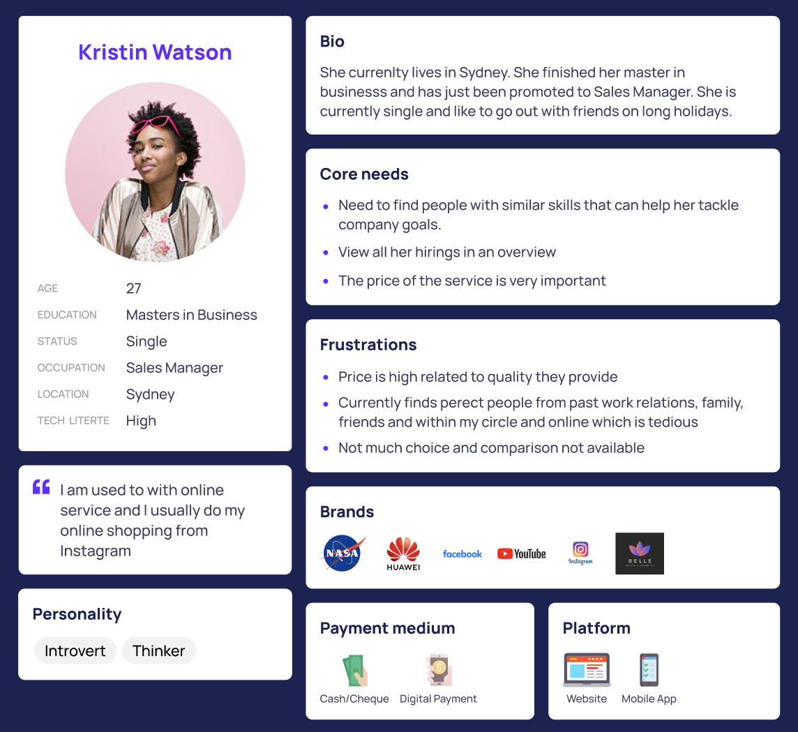
The comprehensive persona
This persona includes a lot of detail—which is what you want from a user persona. It creates space to include all the key information you need in a way that’s easy to understand.
It includes the user's preferred brands, platforms, and payment methods. It also provides a quote that can be used to better understand the persona’s wants and needs.
How does this template excel?
It’s simple and easy to understand—your team won’t waste valuable time trying to decipher what they’re looking at. It includes specific information that provides insights for various teams, and it highlights the persona’s wants and needs. This enables you to quickly and easily identify key opportunities.
This is a solid template for creating personas, but it’s not your only option. Let’s continue looking into our UX persona templates.
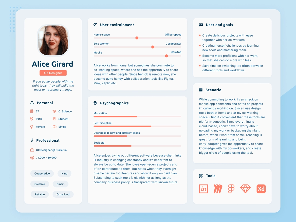
The task-specific persona
This second user persona template is a great example of a template that’s been built on research. The designers included specific sections to fit their findings—instead of the other way around.
The scenario included on the right-hand side of the persona template is perfect for developing a story that helps make a memorable persona.
How does this template excel?
The easy-to-understand template provides a really clear overview of the insights gathered during the research stage. It includes in-depth information on the persona’s thoughts and feelings, and a scenario to paint a persona picture.
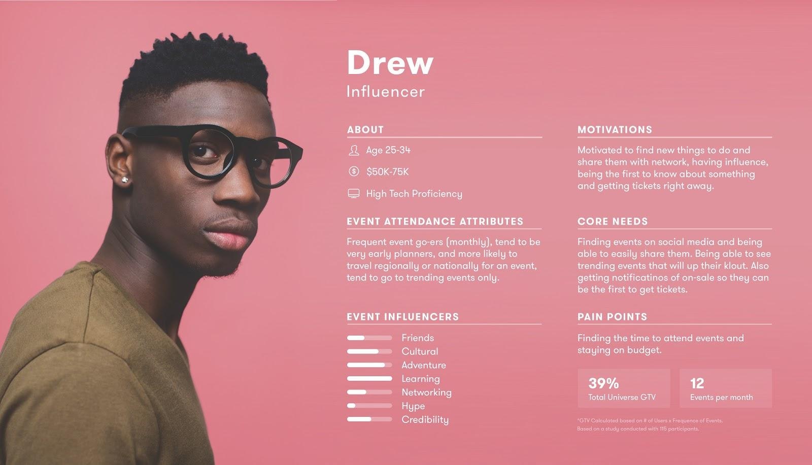
The Gestalt persona
This user persona is a great example of how Gestalt’s principles of design can be applied to creating user personas. Sections aren’t confined by borders, but instead use Gestalt’s principles to clearly differentiate between key sections. This allows for quick viewing, and the proximity of headers to body text makes it easier to link comments to context.
How does this template excel?
The sleek and simple visual design of this template makes it stand out from others, and the sections are specific to its intended use—this persona is for an events management company. It includes information on areas you wouldn’t necessarily see in a user persona template—they’ve been included for this specific purpose and industry.
Overall, this persona is quick and easy—both to create and to understand. This makes this persona template a great tool for key insights into relevant areas that inform different teams quickly and easily.
The collaborative persona
This persona takes a different approach to other user persona templates we’ve seen so far—each section feels like its own document. This template is designed to get input from multiple team members at once. It’s a user persona template that’s been created with collaboration in mind. This is really significant, as working with others brings more diversity to personas.
We’re talking about humans evaluating humans, there’s a lot of opportunity for bias. But the more diverse your team is, the more unbiased your persona will be.

Ash Oliver
Brand Experience Designer & Founder at Foster
Share
How does this template excel?
This template is designed to be built collaboratively. It’s a group activity that brings teams together to develop in-depth user personas.
Sections provide ample space for ideas to be developed—it’s a great template for teams that want to take their research and turn it into a persona over the course of a team workshop.
The innovative persona
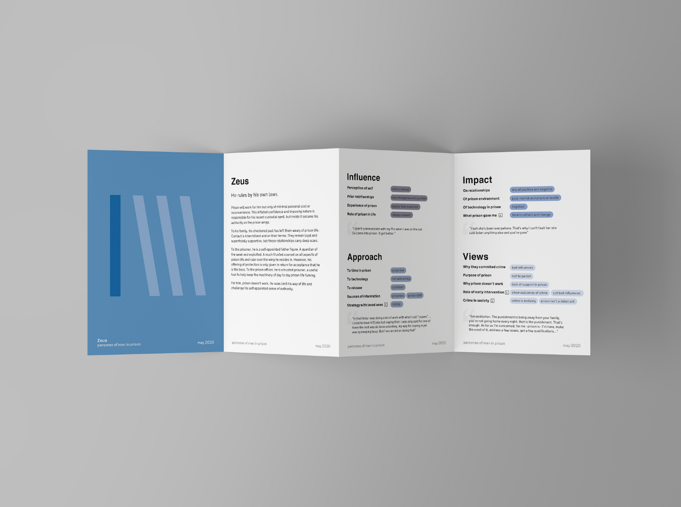
This persona template does more than just display information about a subsection of your audience—it tells a story. It uses a new approach to personas akin to the ones we’ve explained throughout this guide.
It uses a memorable name and image, without allowing space for bias or preconceptions. Its content includes information taken directly from the research conducted.
Like other templates we’ve seen, this one was designed for a specific purpose—to report on the five user personas developed from research into the UK prison system. They were developed over the space of a few months for the UK Ministry of Justice to provide better insights into how prisoners viewed their time before, during, and after prison.
How does this template excel?
These personas were developed with bias mitigation at the forefront of the development process. They don’t include space for images, nor do they include demographic information—in this case, it does nothing for improving understanding and insights.
This template does a great job of telling a story. The sections—influence, approach, impact, and views—provide key insights into the areas that matter for the application of this persona.
This user persona design is a fresh take on what we consider to be user personas. It focuses on users as people, not what defines them in a census.
All of these examples are free user persona templates that can be downloaded and edited as per your requirements. They're the foundation on which you can develop your own user personas for your target market.
Download your free user persona template
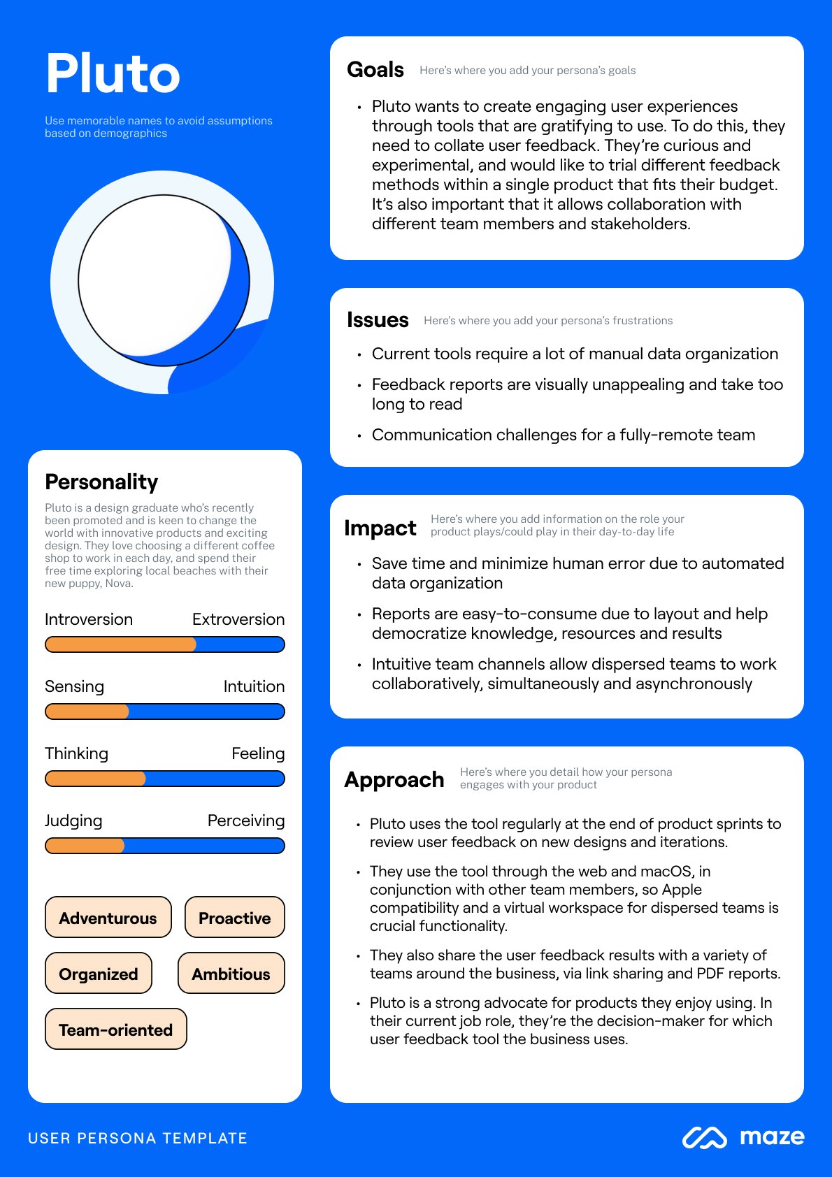
Below we’ve included a UX user persona template for you to download and develop. We've also included a full persona below as an example. It takes into consideration all the tips we’ve highlighted throughout this guide and all the insights collected from Ash Oliver, Brand Experience Designer & Founder at Foster.
Get started with this free template ✨
Kickstart your user persona journey with this free template from Maze.


