Imagine trying to build a town with no bricks, steel beams, or blueprints.
The good news is that you’ve got a handful of talented architects, engineers, and builders. But every street, plaza, building, and bridge must be designed from scratch. And once designed, every brick, board, beam, and buttress has to be individually hand-crafted.
This is similar to how many young startups approach design and development. When you’re small, it might work. But as you grow, this inefficient approach leads to inconsistencies and a lot of headaches.
We’ve been there, and some days it feels like we’re still there. But we’re making progress thanks to Ariane, our design system.
In this article we’d like to introduce you to Ariane—along with a few things we’ve learned about how to build a scalable design system that actually works.
Say hello to Ariane.
Maze’s design system—what it is, and what it’s not
I'm currently the Design Operations Manager at Maze. And like all of my team members, I’ve been helping to build and scale design systems for many years now.
Design systems are a language for designing an experience.
Share
For many people, a design system is a set of UI components and libraries for building interfaces. But a design system is more than a box of UI Lego pieces you can snap together to create different pages. It’s also the guidelines and principles for how those pieces can be put together, and why.
I like to say that our design system is an experience language that helps establish harmony in every context in our ecosystem.
This shared language connects our product, marketing, and technology teams through principles, foundations, processes, and components for creating intuitive and inclusive experiences for our users. A well-designed system increases the quality of these experiences, strengthens our brand consistency, and improves the efficiency of our team’s work.
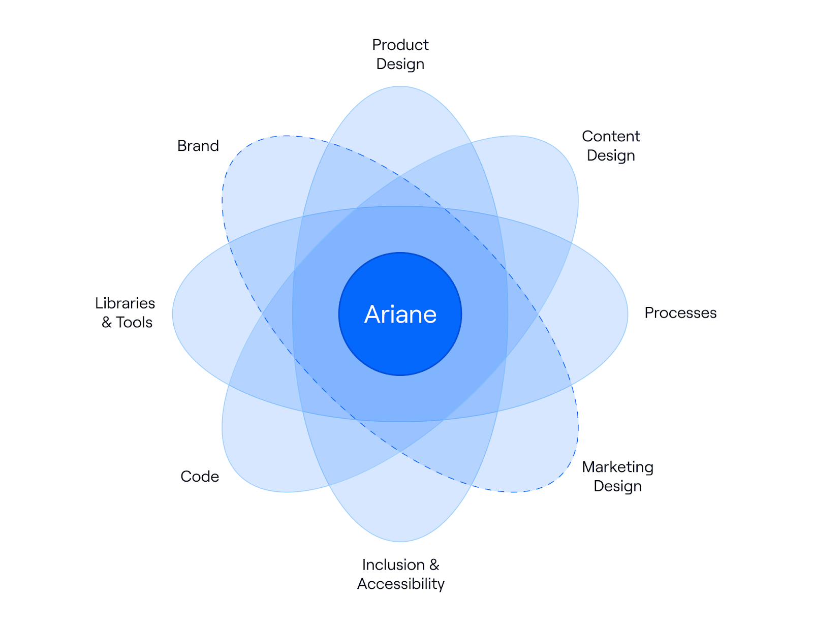
Ariane's design system dimensions
Ariane is multidimensional, tying together different teams and concepts. We can't think about our design system without also considering brand, accessibility, and UX writing.
In case you’re wondering: why Ariane?
In Greek mythology, Ariane—the French version of Ariadne—was a Cretan princess. She is best known for helping Theseus find his way out of the Minotaur’s maze by giving him a ball of thread. And since we’re Maze, helping teams through product decision mazes… well, you get it.
I’ll jump into how to build a design system below. But first, let’s talk about when.
Slowing down to speed up: the right time to invest in a design system
Many people ask: when is the right time to start building a design system?
When a team is tiny, it’s usually not needed. Assuming fluid communication and a team that cares about doing good work, there’s less possibility of discrepancies in the design or code.
But as the team scales, harmonious ways of working are harder to maintain organically. Teams naturally form into silos whose mission is to launch things quickly. Communication breaks down, and suddenly the unity is lost.
Maze has had this fortunate problem of growing fast. So we need to scale our design processes, without compromising the quality that our customers expect. And this requires a certain amount of discipline.
A design system is always an investment for the future. If we don’t invest now, we’ll repay the consequences with technical debt—which causes everything to slow down with inefficiencies later.
Like all growing startups, we realized that we were running a marathon as if it was a sprint. So to be prepared to run the future race, we had to slow down to speed up.
And here’s how we’re doing it.
How we’re (re-)building our design system in 6 steps
To make sure we’re ready for the race, we’ve been redefining everything—from our design foundations and processes, to our component libraries. Here are the steps we’ve taken to (re-)build our design system.
1. Commit to the long, rewarding journey
We had a design system in place, but it wasn’t working. Not because what the team had done wasn’t great, but because it didn’t have a team fully committed to maintaining and evolving the system. So when a product team needed something that no one could help with, they’d do it on their own and components got detached from the system. The cascading effects of this fragmentation added up, both in design and code.
To get your design system off the ground, there has to be a commitment at all levels: from the top to the makers.
If there’s no commitment from the top, you’ll never dedicate the necessary time and resources for success. Regardless of your team’s devotion, priorities will always shift elsewhere. Fortunately, Maze is a design-led company that understands the importance of design systems for building quality at scale, so this wasn’t a blocker for us.
When it comes to adoption by makers—the people and teams using the system—it’s important that they feel they’re part of the solution. They need to understand the purpose of the design system, and have the power to improve it.
Building a design system isn’t something you do in a sprint. Or a quarter. And it’s not something that a single person can do on their own. It’s an infinite game that requires long-term dedication.
2. Audit existing design and code
By the time you realize you need a design system, you’ve most likely already created hundreds, if not thousands, of components, form fields, pages, and interactions. This is your starting point.
We performed an audit of the Maze product and website. The inconsistencies across our brand quickly became apparent, and had a cascading effect on the code.
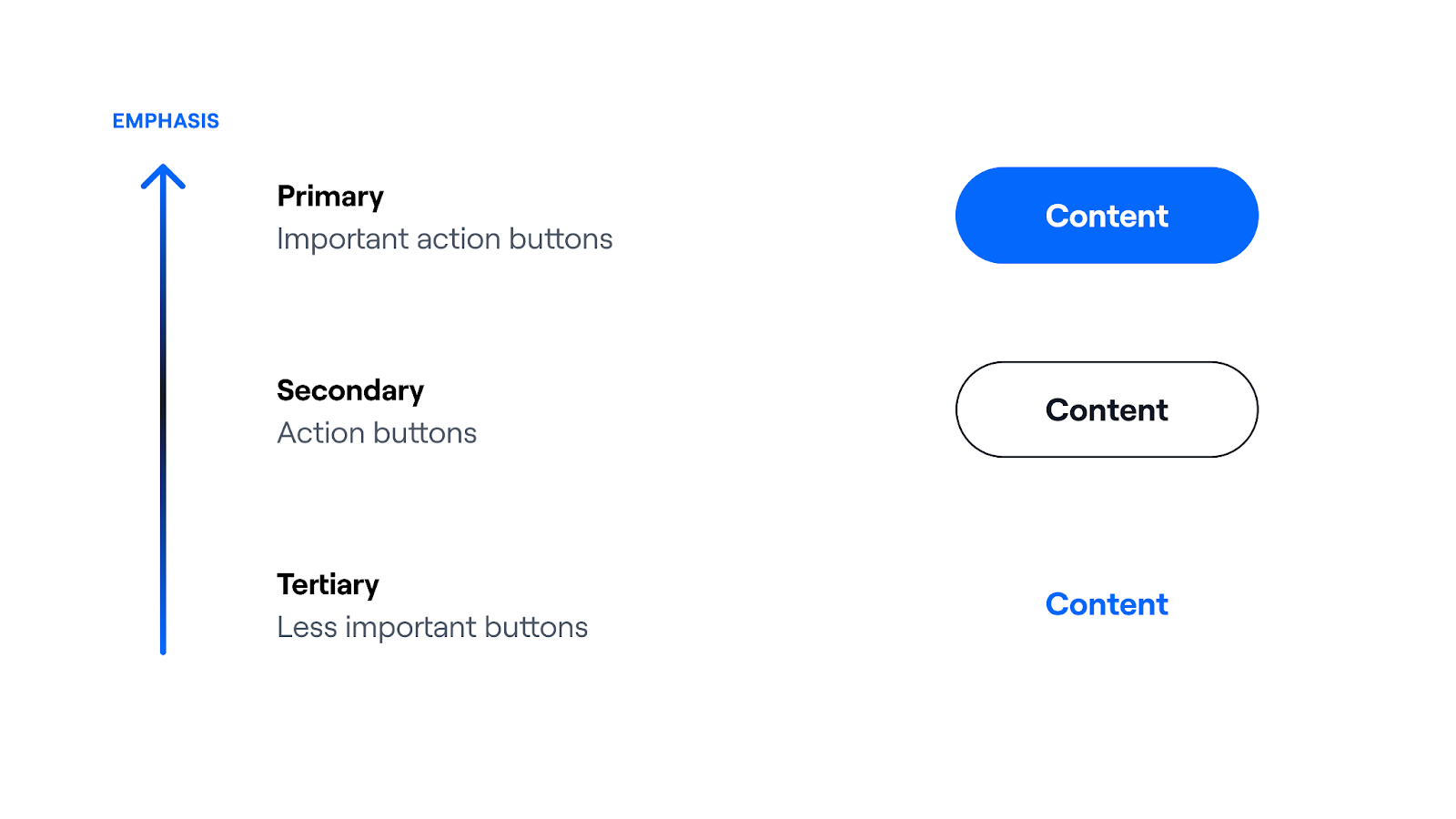
Our old way of showing emphasis on different buttons
The audit revealed that we did not sufficiently challenge the brand in some key areas. For example, the use of visual emphasis to indicate hierarchy wasn’t consistent with other elements that the product design team was using. This provided the input for the next step.
3. Identify and streamline
A good visual hierarchy helps people scan essential information using properties like color, size, spacing, or alignment to organize and prioritize content. So we treated the visual hierarchy as a holistic project, where we didn’t look at things like buttons in isolation, but as a part of the whole experience.
We soon realized that we were making better use of color to progressively indicate hierarchy in other system elements, so we carried this over to the buttons. Suddenly, everything started to click.
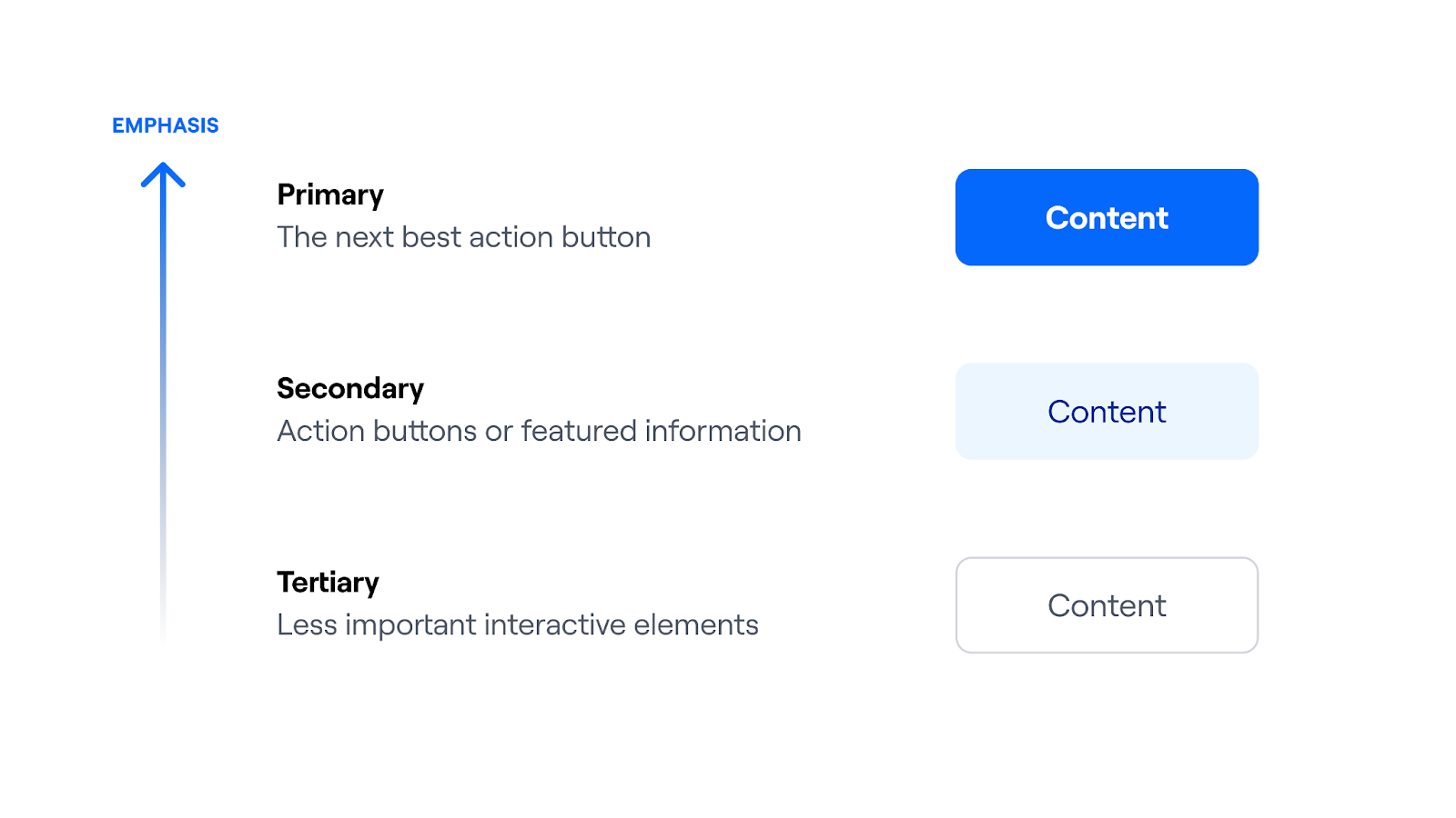
The new way we show visual emphasis for buttons
Now we reserve our primary brand color to help people identify the next best action. We also reserve the use of the bold weight for buttons and headings, making their importance even more apparent.
We use subdued colors for elements of medium importance, and our neutral colors for most of the remaining interactive elements. This put our secondary buttons on par with other elements like badges or banners, and tertiary buttons on par with form controls.
Of course not everyone agrees (see below for more on this), so it’s important to communicate the reasons why certain options are adopted. And then remain open to challenges and iterations.
4. Build bridges with other teams
A design system requires communication and coordination with brand, marketing, content, product, and engineering teams. They’re all part of building a great user experience.
So we ensure that all teams have access to our design system, and share relevant status updates as they happen. And it’s a multi-way street: we’ve laid out our rationale for the button hierarchy to the brand team, and we’re making decisions together to evolve and mature our experience language.
5. Document guidelines for why, what, how, and when
A design system without documentation isn’t a design system—it’s just a collection of reusable UI components. It’s a useful library, but it's not a full language until you define the meaning of each component and rules for their use.
Guidelines need to be explicit for how and when components and patterns are used. It should also include foundational elements, like principles and purpose, along with the expected quality, and who’s stewarding contributions in every maturity stage.
Documentation serves another purpose: it helps ground the abstract ideas in your head, and shines light on cracks in your vision or definitions. This forces clearer thinking and better communication with other teams using the design system.
6. Keep evolving
One of our company values is Iterate everything. This perfectly captures the design-system mindset.
A design system is never done. It will continue to grow as the company and brand grow. This is why it’s so important to have a team dedicated to the maintenance and evolution of your system.
You will never reach a point where you give a company-wide Slack shout-out: “Our design system is done!”
Common design system challenges—and tips
Building a well-functioning design system is a big undertaking. Here are some common challenges we’ve encountered that you should be aware of—plus a few tips if you come up against these walls.
Getting started: buy-in and dedication
Design systems become increasingly important as a company begins to grow. But the inertia of a high-growth company makes this one of the most challenging moments to get company buy-in. And without buy-in for a dedicated team, you’ll end up with a design system that’s fragmented, under-defined, and under-documented. Keep in mind that, to maintain buy-in, you’ll need to continually evangelize the value of the system as it grows. Trust me, I’ve been there.
Tips for getting buy-in:
- Education is part of your job. Put together a business case for your design system with stats and stories from reference companies.
- Give makers roles and responsibilities, along with decision power and accountability.
- Start documenting and collecting design components into libraries, even before you have a dedicated team. Then evolve it as the company allows.
- Start measuring things as soon as possible so you can track progress. For example, our component lifecycle quantifies the quality of our design system, and gives us something we can measure: how many elements increased their maturity this quarter?
Balancing vision with reality
The potential scope of a design system is nearly infinite. But even with a dedicated team, you can’t do it all at once. So realistic timelines for implementation are important for providing transparency and grounding expectations.
Tips for managing scope:
- Start by auditing and refining the designs you’re already using.
- Focus on the most frequently used elements first. Start with your brand's basic foundations and components, and challenge them if needed, then expand to other areas like interaction states and UX writing.
- List out all of the foundations and components you’d like to include. Then add a current status and timeline for inclusion into the system.

A peek at our system status board for Ariane
Navigating competing opinions
Having defined and agreed upon elements and principles sounds great in theory. The problem is that not everyone has the same opinion when it comes to designs, interactions, or even principles. What matters is that everyone understands and accepts the reasons for a given decision, so the team can move forward.
Tips for building unity:
- Help people to zoom out. A change might make sense in isolation but less so when viewed as a whole system. When people see the big picture, they understand things better and are keener to make trade-offs.
- Remind people that ultimately it’s about providing the best experience for end users. All good designers understand the importance of unity and consistency across a user’s experience.
- Encourage challenges and feedback. If someone brings a solid rationale for why a change should, or shouldn’t, be made, the team should be open to hearing their case and making changes when needed.
- Give visibility to recent and upcoming changes to the design system, along with new components being created to cover new use cases. This prompts people to reuse components and encourages healthy conversations.
Managing growing documentation
As the project grows, it becomes more necessary—and challenging—to have a source of truth for each style and component. We use Supernova as our primary design system platform. It has everything in one tool, giving us excellent control over our design tokens and components, and perfectly integrates them with the documentation and code. But ultimately it’s not the tools that make the difference, but the commitment to maintaining them.
Tips for documentation:
- Unify design, engineering, and UX writing efforts to create a single source of truth that covers the system as a whole, not individual parts. This helps to shrink the gap between makers from different disciplines.
- Make it accessible for everyone, and promote it as much as possible to increase awareness.
- Define who has permission—and responsibility—to modify documentation. Not everyone should be able to update it without oversight from the core team.
Adoption and empowerment
Sometimes people get in a hurry and don’t adopt the processes outlined in the design system’s guidelines. Or maybe a team wants a custom design that isn’t currently included. This will happen. It’s a positive form of innovation—we want to give teams the space to try new things and keep challenging the system.
Be prepared for this, and don’t expect everything to go perfectly. It takes time for teams to adopt new systems. And people aren’t machines, so mistakes and creative desires will arise.
Tips for maintaining the system:
- Over-communicate with patience. Not everyone will understand the benefits as clearly as you do, so be prepared to explain even simple concepts multiple times.
- Keep an open door to answer questions and receive feedback from people using the system.
- Provide space for people to try new things, and encourage them to explore.
A design system is never done
So where are we in our design systems journey? I’d say we’ve moved from a state of uninformed simplicity to informed complexity.
We’re no longer building our town—and it’s building blocks—from scratch. But we’re still working through technical debt acquired along the way.
The next step is informed simplicity—making the process as smooth and simple as possible for all makers across the company. We’re aiming for a level of maturity where design system maintenance, rather than creation, is our primary challenge.
But we also know that we’ll never cross the finish line, because a design system is an infinite game. So our system and team will be ready to grow and adapt. Nothing is set in stone.


