


Chapter 12
5 Real-life usability testing examples & approaches to apply
Get a feel for what an actual test looks like with five real-life usability test examples from Shopify, Typeform, ElectricFeel, Movista, and Trint. You'll learn about these companies' test scenarios, the types of questions and tasks these designers and UX researchers asked, and the key things they learned.
If you've been working through this guide in order, you should now know pretty much everything you need to run your own usability test. All that’s left is to get your designs in front of some users.
Just arrived here? Here’s a quick re-cap to make sure you have the context you need:
- Usability testing is the practice of conducting tests with real users to see how easily they can navigate your product, understand how to use it, and achieve their goals
- There are many usability testing methods. Picking the right one is crucial for getting the insights you need.
- Qualitative usability testing involves more open-ended questions, and is good for sourcing ideas or validating early assumptions
- Quantitative testing is good for testing a higher number of people, which is useful for fine-tuning your design once you have a high-fidelity prototype
- If it’s too difficult to organize in-person tests, remote usability testing is a fast and cost-effective way to get the info you need
- Guerrilla usability testing is a great option for some fast, easy insights from real people
- Ask usability testing questions before, during, and after your test to give more context and detail to your results
Why you need usability testing studies & examples
While it’s essential to learn about each aspect of usability testing, it can be helpful to get a feel for what an actual test looks like before creating your first test plan. Creating user testing scenarios to get the feedback you need comes naturally after you’ve run a few tests, but it’s normal to feel less confident at first. Remember: running usability tests isn’t just useful for identifying usability problems and improving your product’s user experience—it’s also the best way to fine-tune your usability testing process.
For inspiration, this chapter contains real-world examples of usability tests, with some advice from designers and UX researchers on writing usability tasks and scenarios for testing products.
If you’re not sure whether you are at the right stage of the design process to conduct usability studies, the answer is almost certainly: yes!
It’s important to test your design as early and often as possible. As long as you have some kind of prototype, running a usability test will help you avoid relying on assumptions by involving real users from the beginning. So start testing early.
The scenarios, questions, and tasks you should create, as well as the overall testing process, will vary depending on the stage you’re at. Let’s look at five examples of usability tests at different stages in the design process.


Discovery phase usability test example: Shopify
Product
The Shopify Experts Marketplace is a platform that connects Shopify merchants with trusted Shopify experts who have demonstrated proven expertise in the services they offer. All partners on the Experts Marketplace are experienced and skilled Shopify partners who help merchants grow their businesses by providing high-quality services.
Feature being tested
When Shopify merchants look for a Shopify-recommended service provider, the first page they find is the Expert profile. There, they can find an overview of services provided, recent client testimonials, examples of past work, and more. If a merchant finds the expert profile page easy to navigate, they’re more likely to reach out to experts and potentially hire them.
Usability testing approach
The Shopify team wanted to make sure they were including all the relevant information in the right place. To do so, they first gathered insights about what merchants would need to know about Experts from generative user interviews.
Once they knew what information was most important, they moved on to evaluative research and conducted card sorting and tree testing studies to evaluate the information architecture of the product.
At that stage of the research process, usability testing was the best way to understand how Expert profiles could create more value for users. Melanie Buset, User Experience Researcher at Spotify and former User Experience Researcher at Shopify, explains:
Now that we knew what information we needed to surface, we needed to evaluate how and where we surfaced this information. Usability testing provided us with insight into how well we were meeting user’s expectations.


Melanie Buset
User Experience Researcher
Melanie worked closely with the designer on the team to identify what the research questions should be. Based on these questions, the team created a UX research plan and a discussion guide for the usability test. After having tested the usability plan with coworkers, they recruited the participants and ran the actual test.
By usability testing, Melanie and the team were able to gather actionable feedback and implement changes quickly. They continued to test until they reached a point where users felt they had access to the most relevant information about Experts and felt ready to potentially hire them.
Test scenario
"Imagine that you’re interested in hiring a Shopify Expert to help with developing a marketing campaign.”
The team wanted to recreate a scenario that would be as close to the real world as possible. For this purpose, they selected participants who had previously been interested in hiring a Shopify Expert.
Task and question examples
Participants were first given a set of general tasks and asked to think aloud as much as possible and to share any feedback throughout the session. Melanie would ask them to show her how they would go about trying to find someone to hire via the Experts Marketplace and go through the process as if they were ready to hire someone.
If the participants got lost or weren't sure how to proceed, she would gently encourage them to try to find another way to accomplish their goal or to share what they would expect to do or see.
The team also asked participants more specific questions, such as:
- What information is helping you determine if an Expert is a good fit for your needs?
- What does this button mean? What happens if you click on it?
Unsure about what to ask in your usability test?
Take a look at our guide to writing usability questions + examples 💭
The key thing they learned
After testing, we learned so much about what’s important to people when they’re looking to hire a freelancer for their business and specific projects. For example, people want to know upfront how freelancers will communicate with them, and they prefer profiles that feel more human and less transactional.
Melanie Buset
User Experience Researcher
Ready-to-use Maze Templates for product discovery phase


Early-stage usability test example: ElectricFeel
Product
ElectricFeel's product is a software platform for entrepreneurs and public transport companies to launch, grow, and scale fleets of shared electric bicycles and mopeds. It includes a mobile app for riders to rent vehicles and a system for mobility companies to run day-to-day fleet operations.
Feature being tested
When a new rider signs up to the ElectricFeel app, a fleet management team member from the mobility company has to verify their personal info and driver’s license before they can rent a vehicle.
The ElectricFeel team hypothesized that if they could make this process smoother for fleet management teams, they could reduce the time between someone registering and taking their first ride. This would make the overall experience for new riders more frictionless.
Usability testing approach
The idea to improve the rider activation process came from a wider user testing initiative, which the team saw as a vital first step before they started working on new designs. Product designer, Gerard Marti, explains:
To address the gap between how you want your product to be received and how it is received, it’s key to understand your users’ day-to-day experience.


Gerard Marti
Product Designer at ElectricFeel
After comparing the results of user persona workshops conducted both within the company and with real customers, the team used the insights to sketch wireframes of the new rider activation user interface.
Then Gerard ran some usability tests with fleet managers to validate whether the new designs actually made it easier to verify new riders, tweaking the design based on people’s feedback.
The next step in their process is conducting quantitative tests on alternative designs, then continuing to test and iterate the option that wins with more quantitative testing. Gerard sees quantitative testing as a vital step towards validating designs with real human behavior:
What people say and what they actually end up doing is not always the same. While opinions are important and you should listen to them, behavior is what matters in the end.
Gerard Marti
Product Designer at ElectricFeel
Test scenario
“You have four riders in the pipeline waiting to be accepted.”
Gerard would often leave the scenario at just this, as he wanted to observe the order in which users perceive each element of the design without sending them in a direction with a goal.
Tip 💡
When testing early versions of designs, leaving the usability test scenario open lets you find out whether users naturally understand the purpose of the screen without prompting.
Task and question examples
To generate a conversational and open atmosphere with participants, Gerard starts with open questions that don’t invite criticism or praise from the user:
- What do you see on the screen?
- What do you think this is for?
He then moves on to asking about specific elements of the design:
- What information do you find is most valuable?
- Are pictures or text more important for you?
By asking users to evaluate individual elements of the design, Gerard invites participants to give deeper consideration to their thought process when activating riders. This yields crucial insights on how the fundamentals of the interface should be designed.
The key thing they learned
After testing, we realized that people scan the page, look for the name, then check the image to see if it matches. So while we assumed the picture ID should be on the right, this insight revealed that it should be on the left.
Gerard Marti
Product Designer at ElectricFeel
Mid-stage usability test example: Typeform
Product
Typeform is a people-friendly online form and survey maker. Its unique selling point is its focus on design, which aims to make the experience for respondents as smooth and interactive as possible. As a result, typeforms have a high completion rate.
Feature being tested
Since completion rates are a big deal for Typeform users, being able to see the exact questions where people leave your form was a highly requested feature for a long time. Typeform’s interface asks respondents one question at a time, so this is especially important. The feature is now called ‘Drop-off Analysis’.
Product tip ✨
Before you even start designing a prototype for a usability test, do research to discover the kind of products, features, or solutions that your target audience needs. Maze Discovery can help you validate ideas before you start designing.
Usability testing approach
Yuri Martins, Product Designer at Typeform, explains the point when his team felt like it was time to test their designs for the new Drop-off Analysis feature:
We had a lot of different ideas and drawings for how the feature could work. But we felt like we couldn’t commit to any of them without input from users to see things from their perspective.


Yuri Martins
Product Designer at Typeform
Fortunately, they had already contacted users and arranged some moderated tests one or two weeks before this point, anticipating that they’d need user feedback after the first design sprints. By the time the tests rolled around, Yuri had designed “a few alternative ways that users could achieve their objectives” in Figma.
Since the team wanted to iterate the design fast, they tested each prototype, then created a new updated version based on user feedback for the next testing session a day or two later. Yuri says they “kept running tests until we saw that feedback was repeating itself in a positive way.”
Tip 💡
Finding participants is often the biggest obstacle to conducting usability tests. So schedule them in advance, then spend the following weeks refining what you’d like to test.
Test scenario
“One of your typeforms has already collected a number of responses. The info you see appears in the ‘Results’ page.”

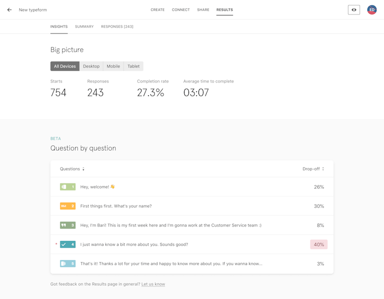
This scenario was designed to be relatable for Typeform users that had already:
Made a typeform
Shared it and collected responses
Visited the ‘Results’ page to check on their responses.
Choosing a scenario that appeals to this group of users ensured the feedback was as relevant as possible, as the people being tested were more likely to use the Drop-off Analysis feature to analyze their typeform’s results further.
Task and question examples
Typeform’s Drop-off Analysis prototypes only existed in Figma at this point, which meant that users couldn’t interact with the design to complete usability tasks.
Instead, Yuri and the team came up with broader, more open-ended tasks and questions that aimed to test their assumptions about the design:
- Tell us what you understand about the information on this page.
- Describe anything missing that you would need to fully interpret the interface.
After the general questions, they asked questions about specific elements of the design to get feedback where they needed it most:
- At the drop-off point, what do you understand?
- What would you expect to see here?
- Does this information make sense to you?
This example shows that you don’t need a fully functional prototype to start testing your assumptions. For useful qualitative feedback midway through the design process, tweak your questions to be more open-ended.
Product tip ✨
Maze is fully integrated with Figma, so you can easily upload your designs and create an unmoderated usability test with your Figma prototype. Learn more.
The key thing they learned
We’d assumed that people would want to know how many respondents dropped off at each question. But by usability testing, we discovered that people were much more concerned with the percentage of respondents who dropped off—not the total number.
Yuri Martins
Product Designer at Typeform
Late-stage usability test example: Movista
Product
Movista is a workforce management software used by retail and manufacturing suppliers. It helps its users coordinate and execute tasks both in-store and in the field with a mobile app.
Feature being tested
As part of a wider design update on their entire product, Movista is about to launch a new product for communications, messaging, chats, and sending announcements. This will let people in-store communicate with people out in the field better.
Usability testing approach
Movista’s new comms feature is at a late stage of the design process, so they tested a high fidelity prototype. Product designer, Matt Elbert, explains:
For the final round of usability testing before sending our designs to be developed, we wanted to test an MVP that’s as close as possible to the final product.


Matt Elbert
Product Designer at Movista
By this point, the team were confident about the fundamental aspects of the design. These tests were to iron out any final usability issues, which can be harder to identify during the process. By testing with a higher number of people, they hoped to get more statistically significant results to validate their designs before launch.
The team used Maze to conduct remote testing with their prototype, which included an overall goal broken down into tasks, and questions to find out how easy or difficult the previous step was.
Test scenario
“You have received new messages. Navigate to your messages.”
The usability tests would often begin in different parts of the product, with participants given a clear navigational goal. This prompts people to act straight away—without getting sidetracked by other areas of the app.
Matt advises people to be specific when using testing tools for unmoderated tests, as you won’t be there to make sure the user understands what you’re asking them to do.
Task and question examples
The general format of the usability test was giving people a very specific task, then following up with an open question to ask participants how it went.
- How would you delete the message, “yeah, what’s up?” that you sent to Mark Fuentes.
- How did you find the experience of completing that task?
Matt and the team would also sometimes ask questions before a task to see if their designs matched users’ expectations:
- What options would you expect to be available in the menu on the top-right corner of the message?
“Questions like this are super useful because this is such a new feature that we don’t know for sure what people’s priorities are," said Matt. The team would rank people’s responses, then consider including different options if there was consistent demand for them.
Finally, Matt says it’s important to always include an invitation for participants to share any last thoughts at the end:
Some people might take a long time to complete a task because they’re checking out other areas of the product—not because they found it difficult. Letting people express their overall opinion stops these instances from skewing your test results.
Matt Elbert
Product Designer at Movista
The key thing they learned
Based on the insights we got from final results and feedback, we ended up shifting the step of selecting a recipient to much earlier in the process.
Matt Elbert
Product Designer at Movista
Live website usability test example: Trint
Product
Trint is a speech-to-text platform for transcription and content creation. The tool uses artificial intelligence to automatically transcribe audio and video from different file formats and generate editable and shareable transcripts.
Feature being tested
The ultimate goal of any B2B website is to attract visitors and convert them into loyal customers. The Trint team wanted to optimize their conversion funnel, and testing the website for usability was the best way to diagnose problems and find the right solutions.
Usability testing approach
The product team at Trint was already using quantitative data to understand what was happening on the website. They used Mixpanel to look at the conversion rates at every step of the funnel. However, it was never enough information to make design decisions. Lidia Sambito, UX Researcher at Trint, explains:
We had to use other pieces of evidence like usability testing to learn how people experienced our marketing funnel and how they felt throughout the customer journey before we were in a position to make the right changes.


Lidia Sambito
UX Researcher at Trint
Lidia worked closely with the product manager and the designer to identify the research questions and plan the sessions. She then recruited the participants and ran the usability test.
The test was run using Zoom. Lidia asked the participants to share their screens and moderated the sessions while the product designer was taking notes. All the sessions were recorded, and the observers could leave their comments by using the Realtime Transcription feature in Trint.
After each session, there was a 30-minute debrief with the team to discuss key takeaways, issues, and surprises. This helped the team reflect on what happened during the session and lay the groundwork for the larger synthesis.
To successfully synthesize the research findings, Lidia listened to the sessions, transcribed them using Trint, and then coded the data using different tags, such as pain points, needs, or goals. Finally, she held a workshop with the designer, engineer, and data scientist to identify common themes for each page of the onboarding process.
This research helped us understand how potential users move across the acquisition funnel and the most painful points of their experience. We identified the main problems and tackled them through ideation, prototyping, and more research.
Lidia Sambito
UX Researcher at Trint
Test scenario
"You have many files to transcribe and your colleague mentioned a software called Trint. He suggested you take a look at it."
Lidia and the team wanted to make the scenario as realistic as possible. They decided to use an open-ended scenario, giving participants minimal explanation about how to perform the task. The key was to see how users would spontaneously interact with the website.
Task and question examples
During the test, the participants were asked to share their comments and thoughts while thinking out loud. The main tasks were:
- Walk me through how you would use Trint for the first time
- Show me what you would do next
Lidia would also ask participants more specific questions to get deeper insights. Here are some examples:
- What information is helping you determine if Trint is a good fit for your needs?
- Tell us what you understand about the information on this page
- What information do you find is most valuable?
- Are pictures, videos, or text important for you?
The key thing they learned
We saw that the participants wanted to see and try out the product as early as possible. Still, it took several screens to get to the product. I recommended removing the onboarding survey. We also worked on the website's content to make it easier for people to understand what Trint is about.
Lidia Sambito
UX Researcher at Trint
Key usability testing takeaways
The examples above offer a heap of insight into how to conduct your usability test, so let’s end with a rundown of the main takeaways:
- Conduct usability testing early, and often: Users want to try a product out asap, and while it may be nerve-wracking to send a fresh product out there, it’s a great opportunity to gather feedback early in the design process. But don’t let that be your only usability test! Take the feedback, iterate, and test again.
- Check your biases, and be open to change: Don’t go into your usability test with opinions and expectations set in stone. Like any user research or testing, it’s a good idea to record your assumptions ahead of time. That way, if something comes up unexpectedly—for example, users don’t navigate the platform in the way you expect—you can run with it and consider new options, rather than feeling stuck in your ways or heartbroken over an idea. Remember, the user should always be at the center of the design.
- Don’t be afraid of a practice run: Usability tests are most effective when they run smoothly, so iron out any wrinkles by conducting a dry run before the real thing. Use colleagues or connections to double check your test, including any questions or software used. A test run may feel like an additional step, but it’s a lot quicker and cheaper than redoing your real test when an error occurs!
Frequently asked questions about usability testing examples
What is an example of usability testing?
What is an example of usability testing?
Usability testing is a proven method to evaluate your product with real people by getting them to complete a list of tasks while observing and noting their interactions. For example, if you're designing a website for an e-commerce store that sells beauty products, a good way to test your design would be to ask the users to try to buy a particular hair care product.
By observing how users interact with your product, where they click, how long it takes them to select the specific product, and by listening to their feedback, you will be able to identify usability issues and areas of improvement.
How is usability testing performed?
How is usability testing performed?
Typically, during a usability test, users complete a set of tasks with a prototype or live product while observers watch and take notes of their interactions. The ultimate goal is to discover usability problems and see how users experience your product.
To run a successful usability test, you need to create a prototype and write an effective usability testing script to outline the goal of your research and the questions and tasks you're going to ask the users. You also need to recruit the participants, run the test, and finally analyze and report your test results.
What is usability testing?
What is usability testing?
Usability testing is the process of testing your product with real users, by asking them to complete a list of tasks while noting their interactions. The purpose of usability testing is to understand whether your product is usable for people to navigate and achieve their goals.
How do you carry out usability testing?
How do you carry out usability testing?
Usability testing can be carried out a number of ways. The most common methods of usability testing include utilizing online usability testing platforms, guerrilla testing, lab usability testing and phone/video interviews.