


")
User Research
The UX research trends shaping the industry (+ expert insights)
Easily test your website sign-up flow with this template. Discover how easy it is for customers to navigate and ultimately sign up to your product or subscription, and learn if any points of friction come between you and them. This template can be run with both lo-fi or hi-fi wireframes or prototypes—simply add your own prototype when prompted.
Quickly and easily determine the success of your sign-up usability task, and collect a usability score for your notes.
Listen to your users and discover their perception of navigation and design through open and closed follow-up questions.
Optimize your website conversion flows by understanding the underlying issues and challenges your users might be experiencing.
How to implement a scalable rapid testing process for design and product that enables you and your team to test early and often.
1
Log in to your Maze account (if you haven’t got one, don’t worry—it’s free to join).
2
Select this sign-up flow template from the gallery.
3
Modify blocks and copy to your preference.
4
Do a pilot test with somebody in your organization (preferably, not on your team).
5
All good? Then it’s time to set it live and wait for the feedback to roll in!
When should I use this template?
If you’ve recently noticed a drop in sign-ups on your website, it may be a good idea to run a quick sign-up flow test to check users are able to find what they need.
How can I improve the sign-up flow experience for my users?
Validate live website sign-up funnel flow
Design • Product • Usability Testing
Validate live website sign-up funnel flow
Validate your website sign-up flow
PRO
Improve site navigation
Research • Design • Idea Validation • Concept Validation
Improve site navigation
Improve your website's information architecture
PRO
Get preference on web designs
Design • Concept Validation
Get preference on web designs
Create exceptional web designs with valuable feedback
Get live website feedback
Content Testing • Feedback Survey • Design
Get live website feedback
Gather insights on your website
Get product onboarding feedback
Marketing • Research • Feedback Survey
Get product onboarding feedback
Identify areas for improvement within your onboarding flow
A-mazeing to meet you!
Welcome Screen
Sign up to [Product] on the [Sport Addict Plan]
Prototype Test • 1 Path
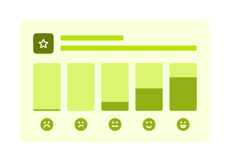
On a scale of 1-10, how was your experience with the interface?
Opinion Scale
How did you find the process of signing up?
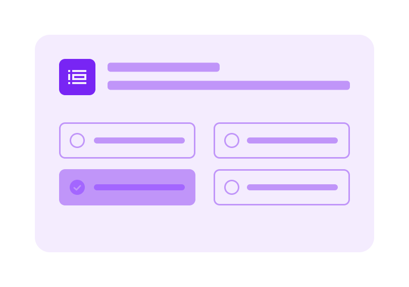
Multiple Choice
What are your thoughts on the design and layout?
Open Question
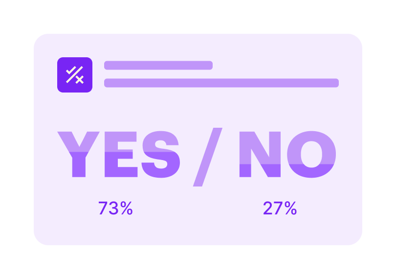
Was the navigation as expected?
Yes/No
What could we do to improve this?
Open Question
How did you find language usage across the website?
Open Question
Any additional feedback on your experience with the website?
Open Question
Thank You!
Thank You Screen

