Chapter 2
4 Key types of prototype testing (and how to choose the right one for your research)

Prototype testing is the act of putting your future product in the hands of your users, revealing usability issues like confusing user paths or illogical information architecture, and gathering valuable user insights on everything from design to copy—all before launch.
Testing your prototype can be done at any stage of design and development, making it a versatile and valuable technique for continuous feedback and design interaction. However, this also means it’s even more important that you choose the right kind of prototype to test, and the right prototype testing method for your UX research.
In this chapter, we’ll walk through four main types of prototype testing, when to use them, and the types of prototypes you can put to the test.
4 Types of prototype testing in UX research
Testing your prototype gives you access to a diverse and vast world of valuable feedback. Prototype testing insights are tightly linked to the type of user research and methods you use—there are many user research methods that work for prototype testing, but here are our top four:
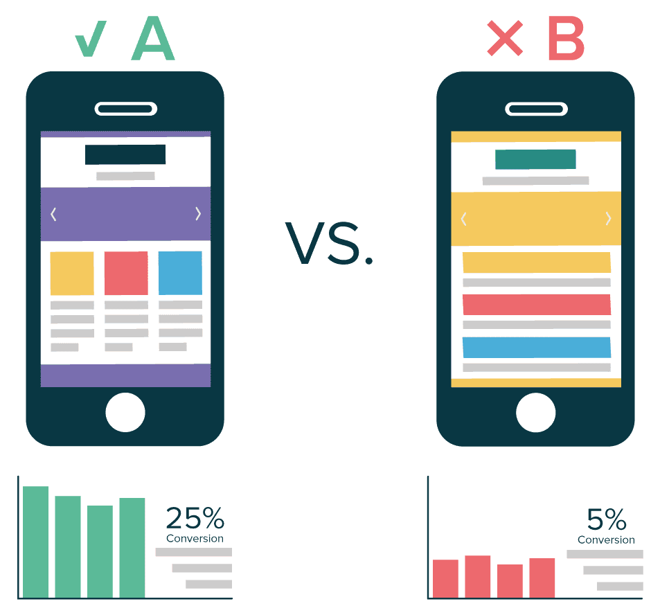
A/B testing is a popular UX research method that consists of testing two alternative versions of your design (A vs. B) on different user segments and developing the version that has better test results—or creating a new, better version.
You can A/B test with any type of prototype: lo-fi, mid-fi, or hi-fi. It’s helpful to conduct A/B testing when prototyping a complete application, adding a new feature, or revamping a current app or site.
✨ Product tip
With Maze, you can run variant comparison tests and create custom expected paths for each version using testing templates. You can also conduct dedicated usability tests or directly test a prototype for multiple variables, including usability. Then, simply share the test with recruited users via a link, collect their answers, and get an automated report with success rates and alternative paths.
When to use A/B testing
A/B testing can be used whenever you need to test two or more versions of a prototype’s feature. While it works for all fidelity levels, it’s best for specific features and near-final design elements.
Some specific prototype elements you can assess with A/B testing are:
- Call-to-action buttons
- Interface designs
- Navigation menus
- Product copy
- Interactive elements
2. Usability testing
Usability testing tells you how intuitive your app is and how easy it is for users to complete certain tasks. It's a crucial step for any product, and it’s possible to run usability tests on any type of prototype—so you can test, iterate, and test again throughout development. There are multiple usability testing methods that allow you to test navigability, accessibility, and UI on paper sketches, digital wireframes, or interactive prototype designs.
When to use usability testing
It’s best to conduct usability testing when you need feedback on how users interact with your product, how intuitively they navigate user interfaces, and how easily they complete tasks without encountering usability issues. Usability testing your prototypes enables you to gather quantitative data that you can use to compare and evaluate design success.
You can conduct usability testing at all prototype fidelity levels for insights on:
- Time on task
- Task success rates
- Assessing user flows
- Drop-off points
3. Wireframe testing
When you have a lo-fi mockup of a design—also known as a wireframe—you can use it to test usability and functionality. During wireframe testing, give your users detailed tasks to complete on your interface design.
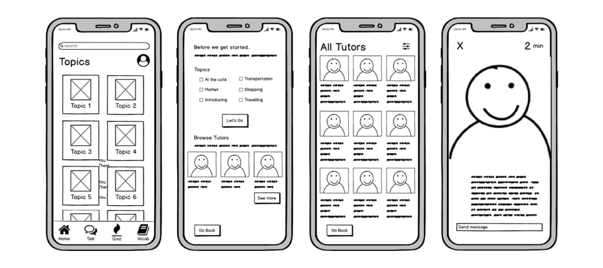
You can conduct moderated or unmoderated wireframe tests and get a mix of quantitative and qualitative user insights. During a wireframe test, you’ll be able to catch issues with confusing user paths, unclear information hierarchy, or vague copy.
When to use wireframe testing
It’s best to conduct wireframe testing in the early design stages when you have basic layouts and structures of your digital product. At this point, you haven’t yet included detailed design elements like color schemes and interactions.
With wireframe testing, you can assess:
- Overall layout and structure of your design
- Information hierarchy and architecture
- User flow
- Element placement
3. Concept testing
This term is often used interchangeably with concept validation, but while they have similar definitions, there’s a key difference:
Concept testing invites you to test multiple assumptions and ideas, and choose the ones you’ll use moving forward.
Concept validation, on the other hand, allows you to assess the feasibility of your product idea with real users before starting the product development process. This stage is critical during prototype development because it confirms whether you’re working on the right solution in the right way, and reveals if your product has a market fit.
With concept testing, it’s also important to differentiate between comparative tests vs. exploratory tests. With comparative tests, you’re looking to compare two distinct design features side by side—as with A/B testing. Exploratory tests are more open-ended and allow your users to naturally interact with your prototype with little to no instruction.
✨ Tip
Save time by filtering ideas that aren’t aligned with your business goals and target market. Learn how to implement a successful idea screening process.
When to use concept testing
Concept testing focuses on the initial ideas or concepts behind your design rather than the design itself. You can use it in the beginning stages of the design process to understand how valuable your digital product will be for users.
With concept testing, you can test:
- User needs and problems
- Value proposition
- Initial user reactions
- Feasibility
What are the types of prototypes you can test?
Knowing your prototype formats and fidelity levels helps you identify the best prototype testing method, and decide what elements of your design users should focus on during testing. You’ll also gain clarity on which design elements you’ll need to add to your prototype later down the line, as you progress through the design and development process.
To inform this section, we spoke with Oliver Prince, UX Researcher at THG, for his input. Before diving in, Oliver shares his thoughts on building the right prototype for the job: “When conducting research that includes prototypes, the fidelity and features included in the prototype should be determined by what you’re hoping to learn."
I believe prototypes should be created with a specific purpose in mind, focusing on the aims of the study, rather than creating a prototype and then retrospectively fitting a method around it.
Oliver Prince
UX Researcher at THG
Share
With that in mind, here are the different types of prototypes and their characteristics.
Low-fidelity, mid-fidelity, and high-fidelity prototypes
In product testing, prototypes vary from low-fidelity (simple, sketch-based models focusing on concept exploration) to mid-fidelity (more detailed, interactive models that begin to address usability) and high-fidelity (near-final products with full functionality and design, used for in-depth testing and feedback gathering).
Prototypes are typically classified into one of these three categories, but what one UX team call a lo-fi prototype, another may call a mid-fi prototype.
The fidelity of a prototype is a spectrum. Personally, I find it beneficial to just be more descriptive of what the purpose of the prototype is, and what qualities it has or hasn’t got.
Oliver Prince
UX Researcher at THG
Share
Don’t feel confined to these three types of prototypes, use these as starting blocks and create what you need—not the one that fits neatly into a theoretical category.
Let’s look at each of them more closely:
Low-fidelity prototypes
A low-fidelity (lo-fi) prototype is an inexpensive and rough version of your product. It could come in the form of a wireframe, a homemade paper sketch, or a cardboard 3D model (if your product is physical). It happens at the earliest stages of the design process.
With a lo-fi prototype, you’re looking to validate concepts and design expected user paths. You want to keep cost and effort to a minimum, so some elements won’t be finalized or even included. Oliver shares how he uses lo-fi prototypes in his UX research:
“If you’re in the early stages of the design thinking process, lo-fi designs can be extremely helpful tools, aiding the researcher and users to clearly communicate fairly abstract concepts and better understand the problems and potential solutions, focusing more on the high-level solution and not being distracted by aesthetics.”
For example, you might include critical buttons, e.g., add to cart, while the other buttons aren’t clickable yet. When you have a low- to medium-fidelity prototype, you probably won’t have a finalized copy yet, either.
What to test at this stage:
- If the layout of your new design makes sense
- Which version of your design performs best with your target audience
- The hierarchy of your information architecture (IA)
- Basic interactions with the design
The benefits of utilising lo-fi designs can often be overlooked, but they can allow you to gain feedback quickly, enabling you to build the correct foundations.
Chris Roy
Former Head of Product Design at Stuart
Share
Mid-fidelity prototypes
A medium-fidelity (mid-fi) prototype gives users a more developed view of how the product will work. It can be used to test paths and gather user feedback. They can click on buttons and explore the product, and you can even test out specific user paths. Key pages will have some copy and design elements already, but secondary pages may still use placeholders.
You’ll also get to review the information architecture at this stage. Since a mid-fi prototype is closer to your final solution, it’ll be more costly and time-consuming to create than a lo-fi prototype.
What to test at this stage:
- Whether user paths match expectations
- If you’ve incorporated user feedback properly
- The success and usability of specific user interactions and actions
- Performance compared to benchmarks or previous versions
- How well your copy and design work in a real world scenario
High-fidelity prototypes
A high-fidelity (hi-fi) prototype is more expensive to develop, being very similar to the finished product. Hi-fi prototypes should be fully usable and have all the needed buttons, copy, and menus available for the user to review. You can also review the final design, fonts, and colors at this stage.
However, your hi-fi prototype doesn’t need to show all your planned features, and some clicks or paths might still feel clunky. Typically, you’d use hi-fi prototypes to conduct usability testing and final checks before launch. Oliver encourages product teams to consider which aspects of a hi-fi prototype should take design priority for testing:
“Many of us visualise testing a hi-fi prototype with clickable functionality, which is a very close representation of the final product. However, where do you draw the line? Do you make everything clickable? Do you have realistic animations? Do you have accurate branding?
“It’s worth considering what are the aims/objectives of the study, and then focus on ensuring the prototype is in line with that. It can be tempting to rush into hi-fi prototyping, especially if you have hi-fi design systems at your fingertips. However, sometimes additional functionality can become a distraction for the users.”
What to test at this stage:
- The design direction of a new product or feature
- Whether the copy adds value to the user experience
- How easy it is for users to complete tasks
- UI components, e.g., accordions and drop-down menus
- Graphics and design elements, e.g., image quality and text readability
Paper or digital prototypes
Whether you use pen and paper to create your prototype, or work with a prototyping tool—this decision will determine your method for transferring your idea into something tangible. Here are paper vs. digital prototypes, what they’re best for, and how they differ.
Paper prototypes

Paper prototypes are hand-drawn sketch representations of digital products featuring basic user flows, user interfaces, and information architecture. These low-fidelity formats are perfect for developing basic user flows and exploring concepts.
As you might have guessed, paper prototypes have no physical functionality, but portray static versions of the UI with minimal detail. They help product design teams understand how users would navigate the future product for completing a specific task.
Paper prototypes are a rudimentary but exceptionally cheap and rapid way to determine whether:
- Your basic user flows and navigation make sense
- Your layout and information architecture are clear
- Users see value in your concept
- Users will be intuitively drawn to the right elements of your visual hierarchy
Digital prototypes
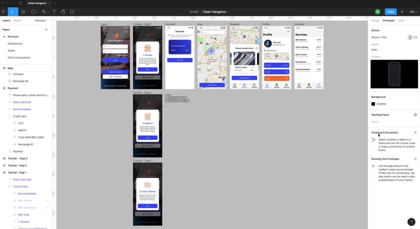
A digital prototype is exactly what it sounds like—a digital model of your product or experience. This prototype format is versatile, ranging from static wireframes of UIs to highly interactive simulations closely resembling the finished product. You can create digital prototypes at any point in the design process—from conception to launch.
Typically, you’ll create digital prototypes with the help of basic graphic design tools like Figma or Adobe XD, or specialist prototyping tools (more on these in chapter three). You can also create native prototypes, that are built within a copy of a digital platform or operating system—making them fully-interactive.
Plus, with the help of tools like Maze Prototype Testing, you can easily test your prototype through various user testing methods, making digital prototypes much easier to test at scale than their paper counterparts.
Digital prototypes are great for testing:
- If your design layout is easy to navigate
- How well your design interactions work
- If your visual design and copy are effective
- How intuitive users find interacting with your prototype
Feasibility prototypes
Sometimes, research alone isn’t enough to test if your product is worth the investment from stakeholders. That’s why feasibility prototypes exist. These are a kind of prototype engineers on the Development team build to test the functional validity of your intended product.
With a feasibility prototype, you can confirm technical and practical viability before your team commits to large-scale development. These prototypes assess if elements of a design or technology can work according to plan while factoring in time constraints, technology, and resources. Feasibility prototypes identify practical hurdles, explore new technologies, and mitigate development risk.
With a feasibility prototype, you can test:
- If the technological approach you’ve determined for development is suitable for your product
- If the underlying concept of your product is practical
- If your product is cost-effective and financially viable
- How well your product integrates with third-party services
Live data prototypes
Live data prototypes use information from APIs, user input, and data to create interactive user experiences closely resembling the final product. High-fidelity and resource-intensive, they connect UIs to databases so UX teams can conduct usability testing for a single sequence, initiated by the user.
With a live data prototype, you’re testing how well your design retrieves and displays data based on user input. For example, users can enter personal information such as an email address or password to receive a custom welcome message on the interface.
With a working live data prototype, you can test:
- The usability of design interactions requiring live data
- Overall performance of interactions and how well they respond
- How well your design handles data-fetching errors
- How well your design can provide real-time updates and notifications based on data input
Creating and testing the right prototype for your UX research: Ask the expert
To help nail down the right approach to prototype testing, we asked Oliver Prince, UX Researcher at THG, for his advice on creating the right prototype for your research, as well as some key considerations to keep in mind when planning your tests.
Oliver emphasized carefully selecting your method of prototype testing, and not being afraid to mix-and-match prototypes of different fidelity.
“Effective prototype testing demands careful consideration of fidelity, purpose, and method alignment. By prioritizing the specific goals of the study and being flexible, researchers can maximise the insights gained from both hi-fidelity and low-fidelity prototypes, ultimately leading to more informed design decisions and enhanced user experiences.”
Using pre-existing data and creating benchmarks against previous prototypes or competitors is also a great way to maximize your insights, says Oliver:
“Testing functionality on existing sites and tools can provide huge benefits, especially in the discovery phase. Using methods such as competitor analysis and usability studies on live functionality can allow you to test functionality without using any design resource and can even allow you to test interactions that would be near impossible to build a prototype for.
“An example taken from one of my previous projects is search engine behaviours, including predictive text. If a designer were to try to recreate this in Figma, the time spent would have diminishing returns. However, utilising an e-commerce site with the same functionality proved ideal and took no time at all.”
Ultimately, prototype testing is one of the most crucial stages in designing a product—but that doesn’t mean it has to be high-tech or expensive. If you get creative, focus on your goals, and choose the right method of testing, you’ll quickly be on your way to a wealth of insights.
Next up: 12 Top prototyping and prototype testing tools
Knowing the different types of prototyping testing ensures you’re selecting the right method to get valuable insights from your users, but you still need to collect and analyze these insights.
Regardless of whichever testing method you choose for your prototype, you’ll need the right platform to help with your prototype testing sessions. Head on to the next chapter of this guide to find the best prototype testing tools for the job.
Frequently asked questions about prototype testing types
How many types of prototypes are there?
How many types of prototypes are there?
There are seven different types of prototypes. They include:
- Low-fidelity prototypes
- Mid-fidelity prototypes
- High-fidelity prototypes
- Paper prototypes
- Digital prototypes
- Feasibility prototypes
- Live data prototypes
What is the difference between concept testing and prototype testing?
What is the difference between concept testing and prototype testing?
Concept testing may or may not include a prototype, and it involves evaluating an idea to see if users find a new topic interesting. It will typically include sketches or mockups and can be a method of prototype testing.
Prototype testing evaluates a working model of the product ranging from low- to high-fidelity.
What are the best practices for prototype testing?
What are the best practices for prototype testing?
Best practices for prototype testing include:
- Conducting a pilot for prototype testing
- Combining methods for prototype testing
- Matching your chosen method to your prototype's fidelity
- Testing your prototype throughout the whole design process

