When you’re planning to launch a new product or feature, variations in the UI design or functionality can be a big point of uncertainty. Which menu design would users find more intuitive? Which icon color do they prefer? What button style stands out more?
UX research offers many routes to test your designs and how they perform, but if you’re looking to pinpoint a winning prototype design over alternatives, A/B testing is your go-to. Let’s get into the specifics.
What is A/B testing?
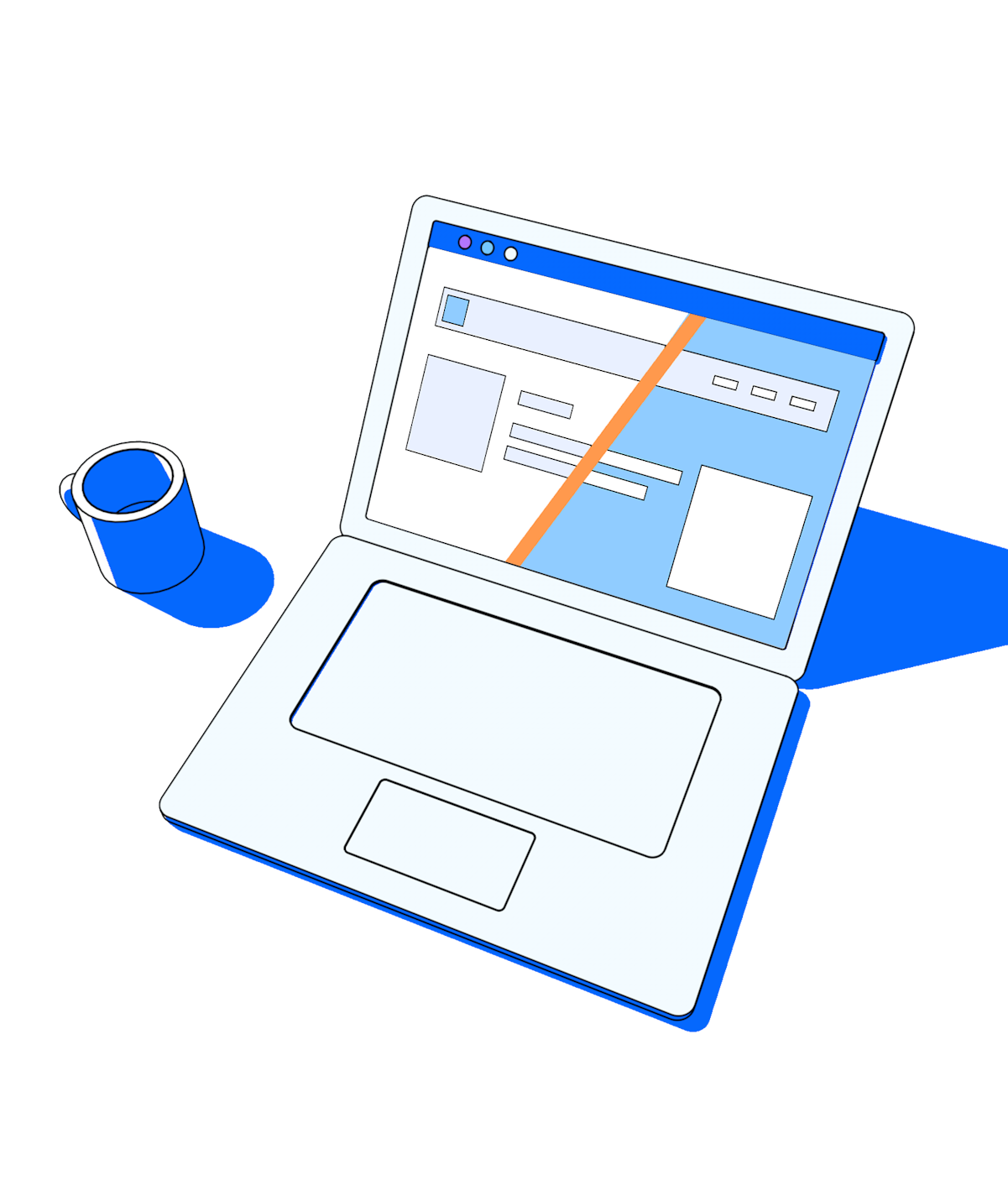
A/B testing, also known as split testing or multivariate testing, is a research method used to compare two or more variations of a design element (e.g. UI elements, copy, or layout) to learn which performs better. The goal is to validate a design hypothesis, such as ‘users will sign up more if the sign-up button is on the left of the page’.
In an A/B test the versions are shown to users at random, with a ‘winner’ being determined by pre-set criteria like sign-up, conversion, or usability metrics.
Prototype A/B testing is a specific kind of A/B test used to compare versions of a prototype. By putting your designs in front of real users, you can determine not only which variant is most successful, but take away additional insights on user behavior and mental models that will inform future design decisions.
What’s the difference between A/B testing and preference testing?
While on paper A/B testing seems similar to preference testing, there are some key differences:
- What they measure: Preference testing gathers qualitative data in the form of subjective opinions from participants, based on what they think or feel, whereas A/B testing determines a winning variant based purely on quantitative data about user behavior.
- When they’re conducted: Both methods can be conducted throughout the product development process, but preference testing can be done on undeveloped UIs. A/B testing, on the other hand, typically requires a developed product or prototype.
Ultimately, if you want to know how a user feels, preference tests or qualitative methods are the way to go. If you’re looking for data on how a user will act, A/B testing will inform your decisions more accurately.
When should you conduct A/B prototype testing?
Like many UX research methods, you can A/B test your prototypes throughout your product development process to ensure you’re always making decisions founded in user opinion. A good rule of thumb is to use A/B prototype testing to make decisions whenever you have two or more versions of copy, visual elements, or expected flows. Examples of when to use A/B prototype testing include:
Determining your product’s flow
Split testing your prototype can help you identify the most intuitive and efficient flow for certain actions, such as adding someone to a workspace, checking out their basket, or signing up for a new account. For example, prototype A may feature pop-up instructions that guide users through the sign-up process, meanwhile variant B offers guidance when the user hovers over a ‘?’ symbol. It’s easy to assume a user will find one option easier than another, so it’s worth A/B testing your prototypes to protect against cognitive biases and ensure your decisions are backed by genuine user data.
Looking to test your sign-up flow? 🔀
Ensure users can register with ease, with this template to test your sign-up flow.
Improving site navigation
A/B testing two prototypes with different versions of navigation or labeling can tell you where your users expect to find information on your platform, and how intuitive the product is to navigate. It’s best practice in A/B testing to only test one variable at a time—but this can be tricky when it comes to navigation and information architecture (IA). For accurate results, keep your focus on small variables like different label copy or a single change in a drop-down menu.
If you’re looking for broader user feedback on IA, you can use techniques like card sorting or tree testing to gauge what works best for users—check out this site navigation template to A/B test your wireframe’s IA.
Making design and layout changes
The prototyping stage is where you get to be creative, and experiment with layout and design decisions. Usability heuristics are a great way to evaluate your UI and come up with small variations to A/B test. Try different visualizations, graphs, colors, and fonts. For example, test a platform with call-to-action (CTA) buttons in yellow, and another variant with them in green. The results may surprise you.
Testing first impressions
Learn what your users remember after seeing your designs for a few seconds: this Maze five-second test template is a speedy way to A/B test designs with minor differences, like icon colors, button placement, different images, or microcopy.
Remember 💡
Make sure you do a pilot run of your maze to guarantee it’s working as expected before you share it with participants.
How to run A/B prototype testing
While avoiding cognitive biases in UX research is always important, this is even more vital for an A/B test. The value of split testing your prototype lies in the test’s ability to pinpoint and evaluate key variables between versions. If something changes—even minutely—between testing option A and option B, the test loses validity.
So, whether you’re using Maze to split test your prototype, or another research tool, it’s crucial to follow the same steps every time if you want to identify a winning variant. Here’s how.
1. Define what to test
The first step—aside from having a prototype, of course—is to determine what you’re testing. What will be your variable, and why are you testing that element? Perhaps there’s been debates about whether the button should be round or rectangular, or maybe one user fed back that a specific section of wording was unclear. Regardless of what part of your prototype you’re A/B testing, it’s important to document why, and what your expected outcome is. Then, test that hypothesis!
Before starting the split test, take time to align with your team on what metrics and KPIs you want to measure. Ensure you’re set up to track metrics that represent a direct result of the variations, but it’s also worth reviewing other performance indicators either side of the test, to gather context and consider the wider repercussions of any changes.
2. Create variations
Design version A and version B of the prototype with the different variables. To get started, you'll need to create the first version of a design, also called the Control version. By changing one variable in the Control, such as the placement of a ‘subscribe’ field or the call-to-action (CTA), you’ll create the second design version, also known as the Variation.
Avoid testing two completely different versions of your design as it will be impossible to tell exactly what’s causing one to perform better than another—instead, go granular and look at details.
3. Select your testing tool
To conduct A/B tests on your prototype at scale, you need a testing tool that can analyze and compile results in a ready-to-share report. For the smoothest workflow, this tool should also allow for different forms of A/B testing and integrate with your preferred design tool.
A research platform makes it easy for you to create tests, recruit participants, and analyze responses all in one place. If you’re using Maze, it also integrates with all the popular prototyping tools like Figma, Sketch, InDesign, and AdobeXD, so you can directly add prototypes to Maze, set up your A/B test, and start gathering results in a handful of clicks.
Tip ✨
For more detailed instructions on how to A/B test with Maze, check out our A/B testing help page.
4. Find test participants
The next step is to randomly divide your target audience or users into different groups. Each group will be exposed to one of the prototype variations, so the size of each group should be statistically significant to generate reliable results. If you’re using Maze, you can either bring your own test participants or recruit from the Maze Panel.
To reach a randomized audience with Maze, you can use custom URL tools, like Linkly or Nimble Links, to redirect respondents to either one of your mazes without intervention. Alternatively, most email tools have built-in A/B test functions to split recipients randomly, meaning you can set up an identical email to share both prototype links.
5. Conduct the study
Share the test link with your target audience to collect data. During the test, you should give your participants a clear task related to the variable e.g. if you’re testing whether a green or blue button gets more attention, make sure your task will require users to click the button. Then, you can measure how long it took and discover which button is more eye-catching.
Your testing tool will record the different steps participants take and show you which path is easier to follow, or which variant had a higher task success rate.
While you can conduct A/B testing in-person or with a moderator, the majority of product teams opt for unmoderated, remote testing as you can reach more participants and reduce any influence from a moderator’s presence.
6. Analyze the results and implement the changes
Now it’s time to discover which of your versions won the split test. Evaluate the performance of each prototype variation against your predefined metrics and determine which version did a better job at achieving the desired objective. At this point, you can also approach participants to ask follow-up research questions to gather additional qualitative insights on their decisions and behavior.
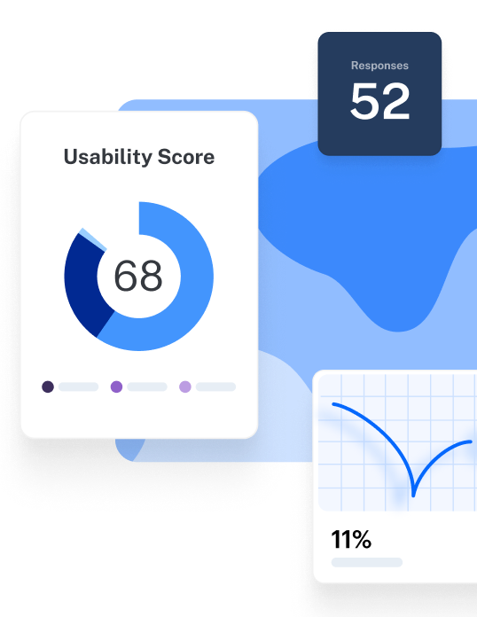
If you’re using a research tool, it’ll likely process and summarize the patterns, trends, and results for you. With Maze, you get a report showing high-level results for each mission such as success rate, misclicks rate, and time spent on screen. If you want more detail, you can also review individual answers and access KPIs such as test duration or number of clicks.
Share the report with your team and colleagues, then book in some time to discuss the insights that emerged and plan how to evolve your product.
7. Iterate and refine
You’ll need to conduct other user research to ensure your prototype is ready for reality, so this won’t be the last step in your design process. But once you’ve implemented the A/B test results on your new prototype, you’re ready to continue with design and development, one step closer to a high usability score and outstanding user experience .
A/B prototype testing is an iterative process, so it’s worth returning to the testing process later to further refine and improve the design. Repeat your A/B test with new variations, informed by other user research, to continue optimizing your design until it’s ready for release.
Product tip 💡
A/B testing can improve the quality of your prototype or live product at any stage of its lifecycle. If you’re adopting a continuous discovery mindset, you can use Maze to conduct usability tests, collect feedback, and gather user insights on your live website.
Best practices for A/B testing
This testing method helps you solve internal discrepancies and lets you make decisions based on your users’ behavior. To ensure you do split testing properly, you should:
- Determine what success looks like: Align with your team on what variables you’re testing, and what metrics you’re tracking, before starting to design different prototypes
- Leave your ego at the door: It’s easy to feel attached to a certain design choice or have strong preferences—so keep your team on track, with the user at the center of each decision
- Focus on testing one variable at a time: To know exactly what’s impacting your results and build the best product possible, you need to keep it simple and take it one change at a time
- Always set counter metrics: Review additional KPIs to see if another metric gets impacted by your variation—positive or negative, you always need to know what changes are happening through the product and why
Prototype split testing: What you need to know
A/B or split testing consists of testing two or more versions of a design with small variations. ICYMI, here’s why A/B testing your prototype helps build a product that solves your user needs:
- Test your prototype using A/B testing to determine the best flows, improve navigation, check first impressions, or adjust design assets
- Start by defining your success criteria then move to designing the variations
- Pick a tool, recruit participants, randomly share the tests, and analyze the results
- Implement changes and iterate on the design
- Focus on testing one variable at a time and making sure your variations don’t affect other aspects of the product
Lastly, utilize a testing tool like Maze to conduct multiple forms of unmoderated testing on your prototype, designs, and live products. Try a continuous discovery tool to turn your users into the decision-makers.
Frequently asked questions about A/B prototype testing
Can Maze do A/B testing?
Can Maze do A/B testing?
Yes! Maze supports A/B testing on prototypes by letting you import multiple variants directly from tools like Figma, Figma Make, Loveable and Bolt. Maze randomly routes users to each version, measures success metrics like task completion and time on task, and generates a clear report so you can identify the optimal design quickly.
Why use Maze for prototype testing?
Why use Maze for prototype testing?
Maze integrates with both traditional design tools, like Figma, and with AI-driven prototyping tools, such as Figma Make, Bolt, Lovable, and Replit, so teams can validate concepts as fast as they generate them. Maze tracks usability metrics, compares variants, analyzes user paths, and produces automated reports, making it easier to move from idea to evidence-backed design decisions.
What is A/B testing in UX design?
What is A/B testing in UX design?
A/B testing compares two or more versions of a design to see which performs better based on real user behavior. Instead of asking users what they prefer, you measure actions like clicks, conversions, or task success. In UX, A/B testing helps validate prototypes, refine flows, and reduce design risk early in the process.
When should you use A/B testing?
When should you use A/B testing?
Use A/B testing whenever you need to choose between two (or more) versions of copy, visual elements, layouts, or flows. It’s especially helpful when testing sign-up steps, navigation labels, button styles, or any interaction where small changes might impact results. Running these tests during the prototyping phase helps teams avoid assumptions and make evidence-based decisions before development begins.


