Redefining our positioning this year meant a fresh rebrand, along with a new website that leaned on marketing, design, and product to execute. The positioning acted as our internal guiding light, aligning each of our teams and provided the foundations for us to build key elements of our go-to-market strategy. While positioning tells a clear story of what Maze is, it doesn’t define how we speak about ourselves to our target audience and the outside world.
In product marketing, it’s my priority to ensure that we are communicating Maze’s values in a way that resonates with our target audience and that our message is consistent across all channels. To do this, we decided to create a centralized marketing messaging document and make it available for the whole team to reference as and when they need to.
Defining your messaging means taking your users’ wants and needs, challenges and goals, language, and interests into careful consideration. To me, this is the bread and butter of product marketing and not getting it right means you risk your audience misunderstanding the value of your product.
In order to have clear, concise, and impactful messaging ready in time for our website launch, it was important to me to test our marketing messaging with real users.
Here’s the process we followed to define impactful marketing messaging that fed into our website copy and wider marketing channels.
Building the foundations
As a remote and asynchronous company, we rely heavily on great documentation within Notion to align and empower every team with the information they need to succeed. I wanted to ensure this theme runs the same for product marketing and so created a messaging matrix. A thorough document detailing:
- Primary messaging: The overarching message of our product offering
- Secondary messaging: Our value proof points, including core differentiators and high-level feature offering
- Product descriptions: A range of descriptions for specific use-cases that the team can come to copy and paste from press release footers to party one-liners
- Persona-specific messaging: Unique selling points for each defined buyer persona considering where they find value
Primary messaging
To identify our primary messaging, I revisited our story, established personas and core value points that needed to be communicated. Primary messaging is different from a positioning statement, which typically follows this structure:
For [target audience], [brand] is the [category] that delivers [point of difference] so they can [end benefit] because [reason to believe].
This format carries the clarity you need to unite internally. But in this tone, it doesn’t speak directly to the end-user and can feel static for those who have to communicate it.
Primary messaging plays with words to create a more relatable vision of value for the end-user.
Naomi Francis
Product Marketing Manager at Maze
Share
Secondary messaging
Secondary messaging breaks down how we deliver that value into core proof points. This is where you elaborate on how you do what you do, what solutions does your product serve? What benefits will users experience when using features? What data do you have that further supports your primary message?
For example, one of our value points is being able to test rapidly, where we support the statement with the fact that most mazes are completed within three hours.
Persona-specific messaging
To define our persona-specific messaging, I worked through the profiles we’d created for our four core personas. Designers, product managers, user researchers, and product marketers all do and care about different things, so require targeted messaging that easily demonstrates the value that’s specific to each of them.
We asked ourselves, how does our product appeal to each of them? What problems do we help them solve? What features do they care about?
Across each of these sections, I explored different variations until we reached a point where we were happy internally. But what did our users think?
It was my goal to validate our primary messaging with each of our four personas, ensuring that:
- The value of Maze is being received in the way we intended
- Our language resonates with personas as a solution to their problems
- People understand where rapid testing fits in their processes
Creating a marketing messaging test in Maze
To test our messaging with users, we decided on three variations of our primary messaging along with one targeted at each persona which we called ‘claims’. Testing messaging prior to it being transformed into creative marketing copy removes the influence of design and enables you to test the impact of the claims as stand-alone statements.
Creating a Discovery maze was the perfect format to reach a number of users asynchronously, giving them a dynamic survey made up of a number of open and closed questions from multiple-choice questions to opinion scales and more.
I decided the best format would be to present users with one claim at a time, followed by a mixture of four questions that gauged reaction and probed perception. Throughout the questions, I used the description field to show the claim to ensure users always had a point of reference. Here’s how I structured the Maze test.
Customized Welcome Screen
To welcome users to the test and provide details on what they can expect from the survey, I customized the welcome screen message. This space was used to explain what we were trying to learn, how it would help us and them, and also to prepare them for the format of the test.
Claims in Context Blocks
Context blocks in Maze are versatile, so can be used to share complete assets, website screenshots, and also plain text. They worked as a great way to share each claim and break up the survey clearly into sections.
In the title field of the block, I added ‘Claim 1’ to be clear that this was the start of one section of the maze, then in the description field, I added the marketing claim up for discussion.
Multiple Choice Questions
I shared this maze with around 600 users, expecting a 10% response rate. With high numbers, I wanted to ensure results were easy to analyze so I used a variety of Maze blocks to add a quantitative element to my survey.
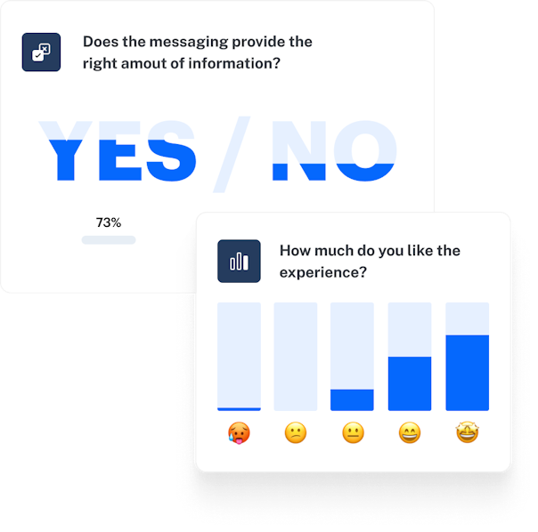
Using Multiple Choice blocks to present users with specific options that would present me with clear visual data, I asked questions like:
- How relevant is the claim to your wants and needs?
- Thinking about the claim overall, which of the following best describes your feelings about it?
- How likely would you be to buy the product based on the claim?
Opinion Scales
Surveys should be diverse in design and form to keep users engaged throughout and present new ways to portray their thoughts and feelings. With Maze, you can adjust Opinion Scales to be rated with stars, emotions, or numbers.
Because I could compare feedback clearly across each claim, I asked the same question on an opinion scale for each one: “How believable is the claim?”
Open Questions
Understanding the why behind user feedback creates more detailed insights that enable us to learn and iterate on the right things. In testing marketing messaging, I wanted to understand what values were clear in each claim. I wanted to avoid leading questions and presenting users with every answer through multiple choice, so I chose to ask an open question, “In your own words, what is the message of the claim?”
When walking through the results, I was able to identify core themes across each of the participant’s answers and establish what was missing, unclear, or overbearing in each claim.
Findings we could act on, in less than a day
Running this marketing messaging test with Maze meant I was able to reach 66 users and gather their feedback asynchronously in less than a day. This kind of reach and pace suited our fast-paced environment; at a startup, you’re juggling many different projects at once and Maze did the hard work for me while I was working on other priorities.
Looking through the Maze Report, I was able to quickly compare metrics from one claim to the next and highlight key themes from the open questions through starring answers that best portrayed the overarching insight.
For example, we found themes around rapid testing, time to insight, collaboration, and democratization—all to our delight! But the results also presented negative themes essential to our growth. We found there were mixed feelings around our use of language which sometimes felt too complicated, inhuman, and sales-like. From this, we could gauge where to focus in our next iterations before launch.
We also found that amongst our personas, one group, in particular, felt the claims to be irrelevant, less likable, and unique. This presented us with the need to further develop our persona profile to truly understand what their needs are, how they think and talk about their work, and how Maze could fit into their workflow.
Testing early on meant accepting that mistakes were going to be made. Sharing with a small pool of our users created a safe space to be wrong and to learn and change before going public.
Naomi Francis
Product Marketing Manager at Maze
Share
We were able to launch confidently, with a messaging matrix filled with claims backed by real users that created the foundations for copy that converts.


