Whether you're new to usability testing or want to improve your know-how, we want to share with you our best tips for creating usability tasks. Tasks are the backbone of usability testing. How you write and structure tasks in a usability test will impact the accuracy of your results.
Usability testing is one of the pillars of good user experiences—uncovering undetected issues, user needs, and pain points. You need to make sure your test is well-structured, and the tasks you write are readable and easy to understand. It's simple to collect skewed data that validates your hypotheses yet isn't representative of your users.
The goal of this article is to share with you what we learned about creating usability tasks. We've been sharing bits of advice in our help documentation and directly with you, but we wanted to bring all our learnings in one post.
In Maze, you build your test out of missions, so in this article, we'll also touch on tips for creating missions. But the advice is applicable no matter what you use to create tasks and test with users.
Pre-testing: Define user goals
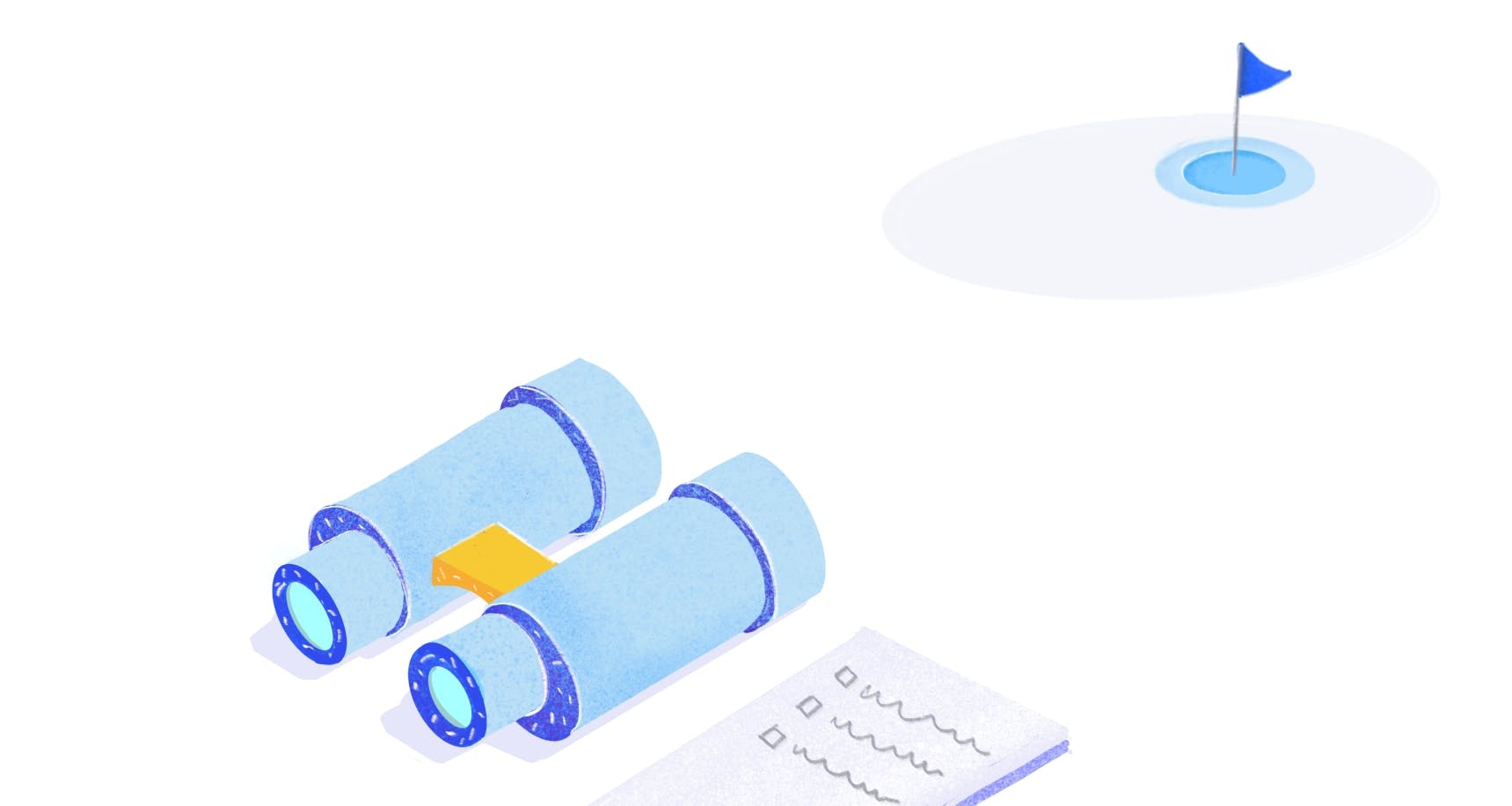
Before you conduct usability testing, and preferably before you design anything—you should always start by understanding your users' goals. If you define user goals from the start, it will help you draft tasks for usability testing.
Define user goals before you start testing
The difference between user goals and user tasks is explained in this article by Paulo G. Latancia. He writes:
A goal is always an expectation for a final condition. The final condition usually has nothing to do with the use of the product itself, so it’s actually an outcome users wish to achieve by using the product as a tool.
Share
Goals are independent of the tool or service someone uses to accomplish them.
Examples of user goals:
- Learn Y topic
- Get to destination X
- Sell my products
On the other hand, tasks are particular to a product or tool. They're explicit actions people take to accomplish their goals. In the same article, Paulo defines tasks as follows:
A task is a step taken by the user during the process of achieving a goal. In order to achieve a goal, users have to navigate through multiple steps completing small tasks. The information architecture of a digital product is formed by tasks.
Share
Let's now roughly draft task examples for the first goal example we mentioned.
Goal
- Learn Y topic
Tasks
- Sign up for an online class.
- Attend online class.
- Pass exam.
- Get certification.
By the time you get to usability testing, you should have defined user goals based on the research you did. They will help you understand how your product helps users achieve their goals. With those goals in mind, you can start drafting the usability testing script and the tasks you need for the test.
Start with a simple task
We’ve shared this tip in our 7 tips to craft the best maze article, but it's worth repeating it here. For users to become accustomed to the testing experience and your product, start your test with one simple task.
Ask users to perform no more than two to three clicks in your first task. For instance, you can begin your test with a walk-through task for users to navigate your website or app.
This will "show users around" by providing context before diving into more complex tasks, and also familiarize them with the testing interface.
Start with a simple task
Give users one task at a time
Depending on the fidelity of your prototype, you might have many elements you want to test in a session. For example, in a high-fidelity prototype, the things you can test are plenty. Our advice is to give users one task at a time, testing each activity step by step.
💡 Tip! Your maze test is built out of missions, so we recommend you keep each mission focused on one task, i.e., one mission equals one task.
Avoid grouping tasks together—this will create lengthy and complicated instructions, and users will have to be reminded about what they have to do. Split tasks up to create the focus on a single 'to-do' activity for your users. By focusing on one task at a time, you'll avoid overwhelming your users.
Follow your design's flow
When a new user arrives on your website, they do certain actions first, e.g., sign up or log in. To create a realistic user test, follow the same flow users take in your live website or product.
Avoid starting your test with a task at the end of the user flow and then jumping to the start of the flow—this will only disorient users.
Follow the user flow when you create tasks
When you create missions in Maze, you’ll notice that each new mission starts with the last mission’s screen. That’s on purpose. By starting on the same screen users previously were, you’ll create a natural feel for users going through the test.
💡 Tip! You can change the start screen of a mission if you need to, but make sure the jump from screen to screen makes sense.
Make tasks actionable
The premise of usability testing is to learn if users can complete tasks using your product. For this, you have to create similar tasks to those users do in real life in your app or website.
One way to encourage users to interact with the design is to use action verbs in your tasks. Examples of action verbs specific to usability testing are create, sign up, complete, check out, buy, subscribe, download, invite, etc.
An example of an actionable task is: Create a new project in your dashboard.
Making your tasks actionable will encourage users to click or tap on your prototype, and this will help you gather the data you need to analyze usability: clicks, misclicks, time on screen, and more.
Set a scenario
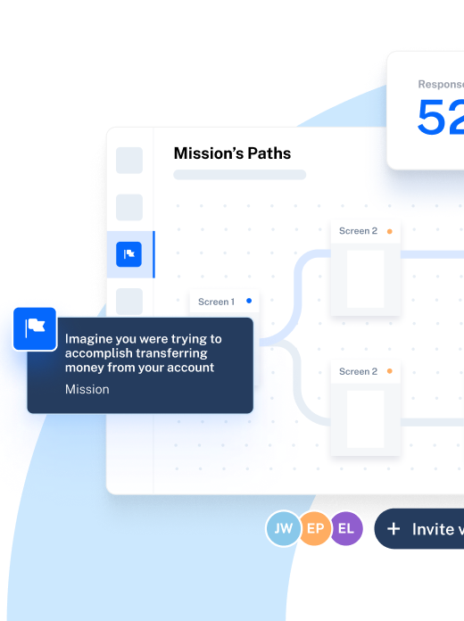
When you create missions in Maze, you’re asked to set a title and a description. The title sets the task's purpose or what you want the user to accomplish, while the description is an explanation of the task, and includes all details you need users to know.
The description is the place you can tell the 'story' and set a scenario for the task. For example, imagine this as an example of a task: Purchase plane tickets. In the description, you can give details and set the scenario:
"Your annual summer holidays are coming up. You need to book tickets for your family. Check out tickets for Greece, and purchase return tickets for all three members of your family."
Such a description gives users the task (purchase plane tickets) while being clear on why they need to do it (holidays are coming up). This scenario also shares the details they need to know to be able to complete the task: number of people (three) and destination (Greece).
Avoid giving precise instructions
One of the most important rules for writing usability tasks is to avoid asking leading questions. Try to keep your usability testing questions open-ended and unbiased. If necessary, get a copywriter to review your questions and task prompts.
Words that can give away hints are click here, go to, or navigate to. Similarly, "How much did you enjoy this product?" is a leading question that biases the answer towards your expectation that the user 'liked' the product. Instead, ask a more open-ended question like "What did you think of this product?" to get honest replies. If you give away the answer, you'll be collecting skewed results that don't reveal if users struggle when using the product.
Testing should approximate real life as much as possible. When your design will be implemented live, actual users will have to learn how to use it without much instruction. That's the reason you're testing in the first place: to understand if your design is easy to learn and use.
Include up to eight tasks in a test
Last but not least, we recommend you create tests with up to eight tasks, especially if you plan to do remote unmoderated usability testing. Our internal data reveals that maze tests with more than eight tasks (missions) have a high drop-off rate. Longer tests take more time to complete and require more effort—so they are usually abandoned by some users.
Usability testing relies on user feedback and their willingness to offer you this feedback. It's our responsibility to create tests that don't take up big chunks of users' time.
TLDR: 8 quick tips for writing usability tasks
Making the tasks easy to read and act upon, and respecting users' availability are good practices to keep in mind if you want to get valuable and accurate results from usability testing.
- Define user goals. You should have a clear understanding of users' goals and how your product helps users achieve them. This will help you write tasks for usability testing when the time comes.
- Start with a simple task. Begin your test with one simple task to familiarize users with the product and the testing experience.
- Give users one task at a time. Avoid overwhelming users by giving them multiple tasks at once. Let them complete (or give up) each task before you present them with a new one.
- Follow your design's flow. Understand and apply your design's flow to the usability test to create a realistic scenario.
- Make tasks actionable. Use actionable verbs like download, buy, sign up in your tasks to encourage users to interact with the interface.
- Set a scenario. Set a scenario to help users understand why they're completing the tasks and give them all the details they need to know.
- Avoid giving precise instructions. Steer clear of words such as 'click on' or 'go to' to avoid leading your users towards the task answer.
- Include up to eight tasks in a test. When testing remotely, keep tests short by including up to eight tasks in one test.

