
How Braze tested a Figma prototype 3x faster using Maze
Braze turned a three-week usability testing process into an agile one-week workflow at 30% the cost with Maze.
About Braze
Braze is a lifecycle engagement platform that connects companies to their customers through interactive conversations.
Industry
Tech & Software
Opportunity
As Braze looked to add Multimedia Messaging Service (MMS) support to their platform, the design team saw a chance to rethink their usability testing process.
Key Maze features used
Prototype Testing
Surveys
Share
3x
reduced time-to-insight
70%
reduction in testing costs
Braze is a lifecycle engagement platform that connects companies to their customers through interactive conversations. As Braze looked to add Multimedia Messaging Service (MMS) support to their platform, the design team saw a chance to rethink their usability testing process.
Chino Wong, Director of Product Design at Braze, and Yuna Akazawa, product designer, used Maze to quickly run a detailed usability test on two versions of their latest Figma prototype. Within a week, they were able to confidently determine which version of the flow resonated better with users, and then use that data to make confident design decisions, such as carefully adjusting the placement of preview information.
Using Maze has supercharged our product design process and made it possible to drive faster turnaround times, speeding up product iteration, and making for better, faster user experience.
Yuna Akazawa
Product Designer at Braze
Share
Why usability testing is critical to the design process at Braze
Braze boasts more than 800 customers and 500 employees around the world. Designers like Chino and Yuna work across departments every day to understand user flows and the end-to-end customer experience.
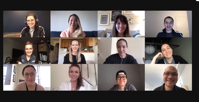
The design team at Braze, living the remote-work life
The design team is instrumental in creating intuitive user experiences that, in turn, help the users of Braze build great experiences for their own customers. “The design team collaborates most often with our counterparts in product management and engineering, but we also work closely with our partners in customer success and technical support to connect with customers, with our business intelligence (BI) team to understand better how our customers use the product, and with marketing and the overall go-to-market team to align on how we can improve the overall Braze customer experience,” says Chino.
The overall design process at Braze consists of five stages: discovery, ideation, prototyping in Figma, usability testing with Maze, and iteration. Usability testing is critical for Braze because it can reveal problems with a design before they’re put into development, uncover new solutions to the same problems, and give designers confidence that their solutions will work well.
Usability testing helps to reduce the risk that we’re building the wrong thing for our customers, while also bringing colleagues outside of the design team closer to our customers and their direct feedback.
Chino Wong
Director of Product Design at Braze
Share
The team breaks down usability testing into five steps:
First, they consolidate questions and hypotheses that came up during prototyping and internal testing in Figma. Next, they import their Figma prototype into Maze, and then design custom user tests to capture both quantitative and qualitative feedback. After a dry run with internal stakeholders, they launch the tests and start gathering data.
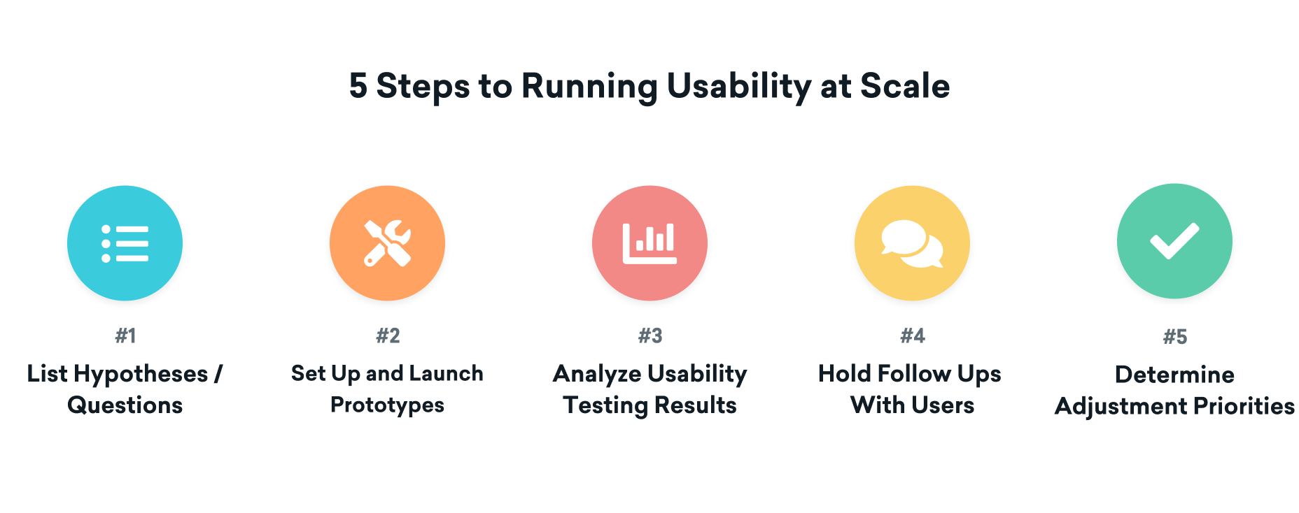
Usability testing process at Braze
One advantage of remote user testing for Braze is that it lets them start looking at qualitative feedback as it comes in, and then analyze quantitative data once enough users have completed the test. After they’ve finished synthesizing the results, the team follows up with some users to get a comprehensive picture of their experience. The last part of usability testing is to prioritize iterations based on the insights and feedback they’ve gained.
Why Braze chose Maze to accelerate their usability testing
It would have taken us at least 2-3 weeks to have complete testing the old way.
Yuna Akazawa
Product Designer at Braze
Share
What made Maze the right tool for usability testing at Braze? Chino and Yuna say that it came down to Maze's analytics, recruitment controls, and speed.
Braze designers use a variety of software tools for research. But as Yuna puts it, they’re “just getting their feet wet” in usability tooling. Traditionally, they run usability tests via video chat, but this can be very time-consuming.“There is about 11 hours of video conferencing time in the process we normally follow, and with the added time associated with reaching out to clients, coordinating schedules, and scripting the test, it would have taken us at least 2-3 weeks to have complete testing the old way,” explains Yuna.
Chino also has to account for the confidential nature of their designs:
Because a lot of what our design team works on is confidential, we needed to set controls over who had access to the prototype while we were creating it, and restrict access with simple password settings when recruiting participants. Maze made that process easier than other platforms we’ve tried.
Chino Wong
Director of Product Design at Braze
Share
Maze solves these problems by importing prototypes directly from Figma and letting team members restrict test access with a password. The former helps Maze fit seamlessly into the Braze design workflow, and the latter gives them the recruitment control they need to bring in more testers without compromising on security.
Setting up a prototype split test in Maze
During the MMS feature design process, Chino, Yuna and the rest of the design team came up with several hypotheses and questions surrounding user workflow adoption and understanding, usability, and visual communication:
- Workflow adoption and understanding: Will users be more likely to upload media files earlier on, if Braze showcases that feature at the beginning of the flow?
- Usability: Will users be less likely to upload non-Braze-hosted images, GIFs and other assets if they display the option as a tertiary button versus as a stand-alone field?
- Visual communication: Will users understand better that they can’t control the ordering of MMS messages if they put a more visually-prominent banner in the preview?
Chino knew that their traditional user testing methods wouldn’t get them the data they needed fast or early enough in the design process. Luckily, he’d been following Maze for a while, and now he saw a chance to accelerate their process by testing their hypotheses through unmoderated usability testing.
The design team produced two versions of a Figma prototype with different layouts and flows. Yuna took advantage of the Figma+Maze integration to seamlessly import both prototypes into Maze, and then created custom surveys to gather both quantitative and qualitative feedback.
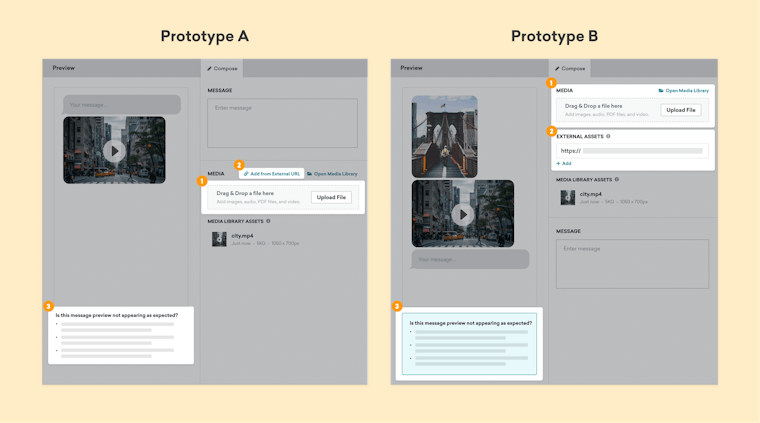
The two prototypes that Braze tested using Maze
Because the two versions of the prototype contained entirely different user flows, Yuna wanted to tailor her tests to match each experience being evaluated. To do this, she decided to set up two different user tests in Maze.
Yuna set a desired user path for each prototype, and then asked users to go through the prototypes on their own to see how closely they followed the ideal. At the end of each test, she asked users to rate their overall satisfaction using a 5-point Opinion Scale block. She also added Open Question blocks to gather qualitative comments and free-form responses, and to collect testers’ email addresses to follow up with them.
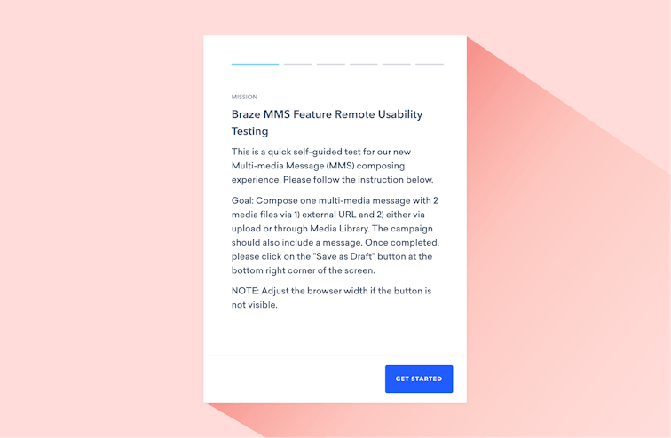
Intro screen from Braze MMS feature usability test in Maze
First came a pilot test with some of the Braze product team, after which Yuna slightly tweaked her questions based on their feedback. Once the final tests were ready, Yuna shared them through the Braze Bonfire customer community to find people who were interested in evaluating the MMS workflow. The design team invited volunteers to a private Slack channel where they sent users links to the two tests with instructions.
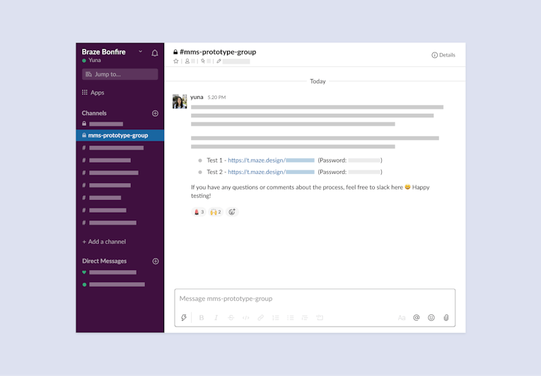
Braze uses a private Slack channel to invite testers
Analyzing the results of usability testing to identify improvement opportunities
Step three in the Braze usability testing process is data analysis. Previously, the design team would have had to wait weeks to get data back from a handful of testers. With Maze, they got useful insights almost immediately as responses started coming in from more than 20 Braze customers.
From the moment we launched our usability test, it took only a week to get useful results—and we were able to begin synthesizing results as each user response came in, giving us a real-time picture of how the tests were progressing. That speed and clarity was a big plus for us.
Yuna Akazawa
Product Designer at Braze
Share
For this test, Yuna and the team started by noting common themes and topics in the qualitative responses to their open-ended questions. They found a wealth of useful insights, including notes about additional capabilities that testers would want to see, questions about the prototypes, and email addresses from testers who were open to providing further feedback.
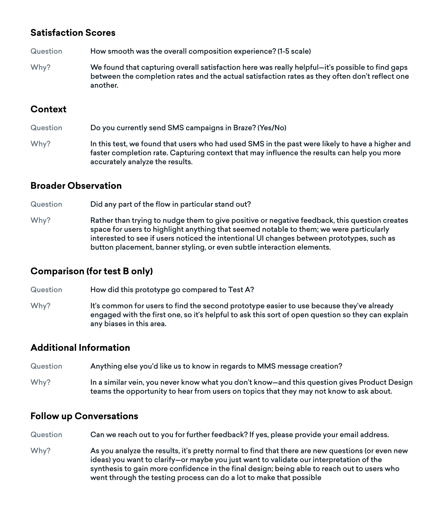
Qualitative user feedback from Braze user tests in Maze
Next, the team turned their attention to participants’ overall satisfaction rate with each prototype, measured by 5-point Opinion Scale blocks. From this data, Yuna confidently concluded which version of the flow testers preferred.
- Prototype A: 4 stars - 56%, 5 stars - 33%
- Prototype B: 4 stars - 50%, 5 stars - 25%
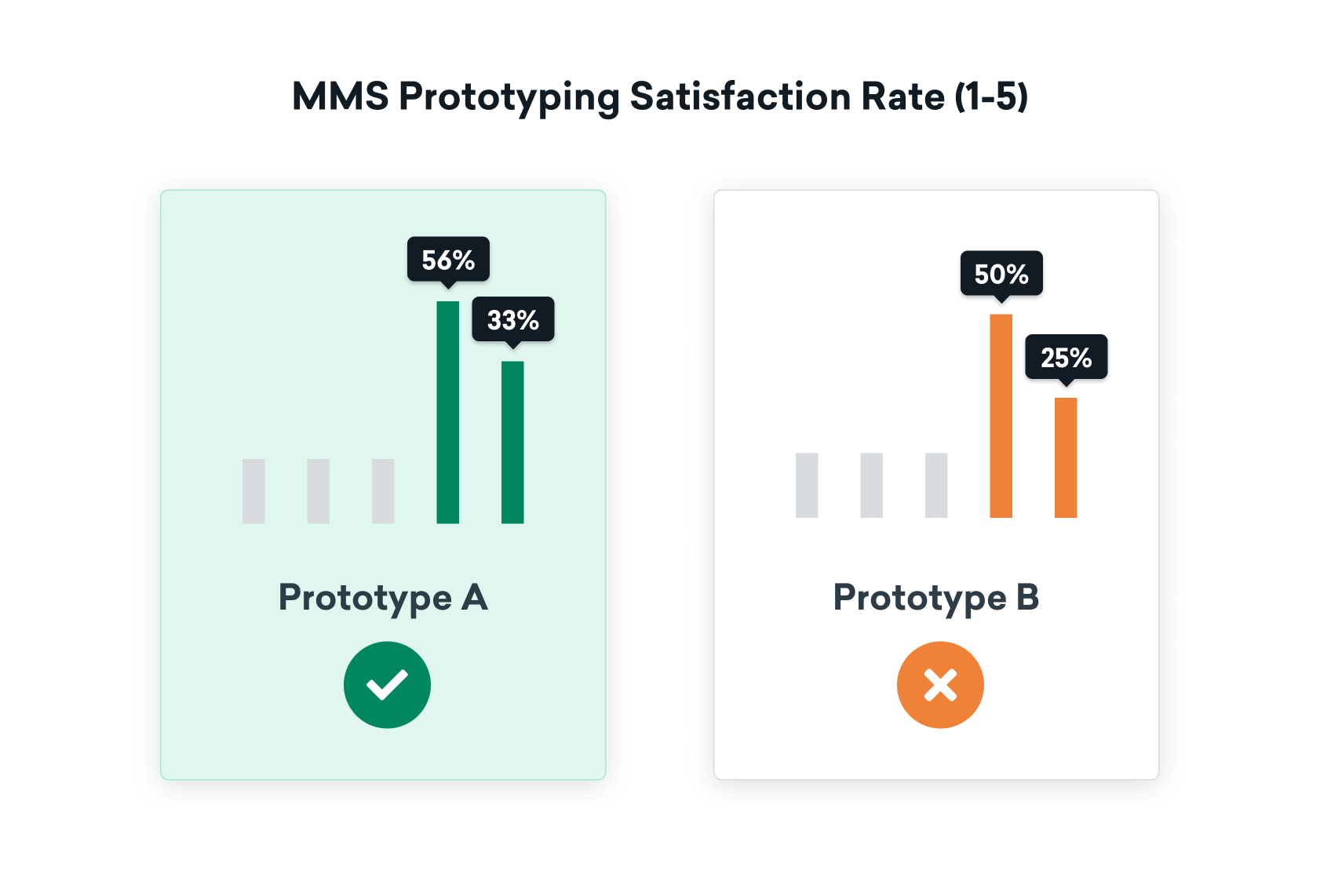
Results from Braze’s 5-point Opinion Scale blocks
Maze’s heatmap reports were also a big help in understanding how users interacted with each prototype and screen. Yuna analyzed each user’s path and interactions to identify common behaviors and recurring patterns. All told, Braze got the results they needed 3x faster, at 30% of the cost based on the number of people-hours they saved.

Heatmap from Braze’s usability test in Maze
Using the heatmap, I was able to really dig deeper into certain usability concerns or questions and then address them accordingly by going through each user’s interaction with certain parts of the design, gaining micro-level analytics.
Yuna Akazawa
Product Designer at Braze
Share
Making confident design decisions based on usability data
From the results of the test, Yuna and the design team were able to confidently determine which prototype’s user flow resonated better, and why. They were also able to make informed design changes, such as changing the placement of the media upload preview information because the data showed that users weren’t finding that intuitive and easy to use.
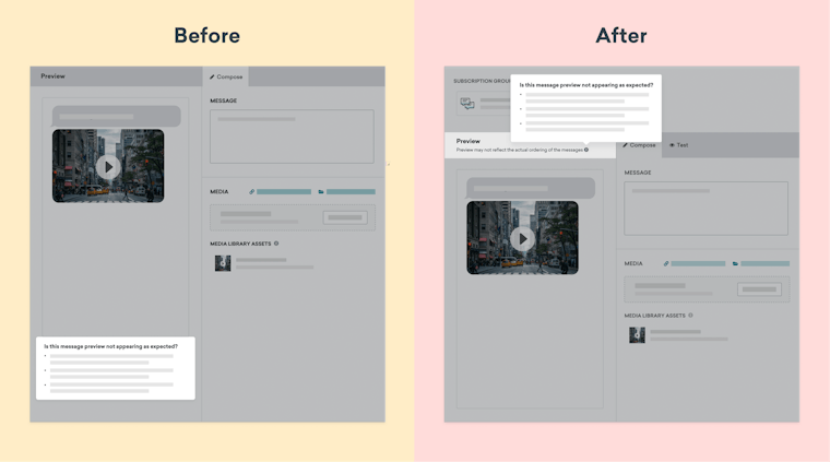
Braze changed where they place preview info, based on usability testing data
The team is also providing better visual differentiation for their Subscription Group dropdown, and generally improving how they display SMS/MMS in the Braze dashboard, to further enhance user experiences and success rates.
Meanwhile, Braze continues to scale the design team's work, thanks in part to the efficiency and insights they get from usability testing tools like Maze.
By exploring and leveraging tools like Maze, we’re investing in the long-term work involved in building Braze, providing a better experience to our end users, and pushing the boundaries of what’s possible with our product.
Yuna Akazawa
Product Designer at Braze
Share
