Were you to make a list of the "most disruptive companies," McDonald's probably wouldn't make the cut, but maybe they should. It might seem their main contribution to food was updating the format, but that's not true. Though they may have popularized fast-food, plenty of walk-ups and drive-ins already existed. What they did do was revolutionize the process of how food is made and served.
Whether it was the amount of ketchup and mustard they put on a burger or the starch to water ratio of potatoes they used for french fries, McDonald's considered every detail to ensure a consistent experience for their customers. Not only did they change their process, but by adding the drive-thru, they revolutionized how we interact with restaurants.
Though we may commonly associate UX design with the digital world, McDonald's shows us that UX isn't limited to tech-based products. By thinking about not only the quality of the product but also the quality of the experience, McDonald's was able to become the food giant we know today.
No matter if you're making burgers, computers, or websites, there's now much more consideration for the user experience than ever before. By extension, the process of creating the best user experiences has also changed over time due to the increase in customer expectations and investment in design. In this article, we'll look at how UX practices evolved through the prism of five well-known design quotes.
1."Some people think design means how it looks. But of course, if you dig deeper, it's really how it works." — Steve Jobs
In the last decade, there may not be a company that has impacted design more than Apple. Their fearless leader, Steve Jobs, was notorious for his attention to detail and obsession with the user experience. In fact, there's a wonderful article by Malcolm Gladwell that suggests tinkering and his ability to make many minor improvements was Jobs' real genius.
Jobs' affinity for aesthetics and user experience produced more than good design quotes. In February of 2018, Apple became the first company to be valued at a trillion dollars. Though many factors contributed to the success, their products' ease-of-use is often cited as the main component of their success.
By making their technology more user-friendly, they also made it less intimidating for new users. The next time you're building a process, ask yourself this question, "Can my parents use it?" and if the answer is no, then there's probably still more work to be done.
2. "If you find an element of your interface requires instructions, then you need to redesign it." — Dan Rubin
There are certain things in life we expect will require reading the user-manual. You wouldn't think to put together something from Ikea without the instructions, but that shouldn't be the norm. When navigating a website or app, if something isn't where we expect it to be, we're more likely to abandon it for a simpler product.
Unsurprisingly, we tend to prefer designs that are more usable. What makes something usable can be measured in a few ways. One approach is to conduct usability testing to learn if users can accomplish their tasks and look at how effective the product is overall.
Ask yourself if the amount of effort put in and the result gained are equal. Think about booking a room on Airbnb. Most people can visit their site and go through the booking process without any guidance and do so relatively quickly. It's intuitive.
If you're concerned about the resources needed to test a design, it may require less than you think. There are tools available that make user testing easy, and doing those real-world tests could pay huge dividends, so the investment is warranted.
3."Clutter is the official language used by corporations to hide their mistakes." — William Zinsser
Have you ever seen the TV show Chopped? In it, chefs are given a basket of ingredients that don't go together and have to compose a dish using those items. When there's a particularly difficult ingredient, a common tactic is to try and hide it in the dish by surrounding it with lots of other elements.
Though they may succeed in covering the unwanted flavor, the approach generally ends with the dish being muddled and lacking cohesion. UX design is similar. Adding a useless element could help make it more "beautiful," but it will negatively affect the overall experience for the user.
The idea of "keeping it simple" is a very common thread in quotes on design, and it's for a good reason. Research done by Google shows that people consistently rate visually simple websites as more beautiful than complex ones. Why do simple designs perform better? The plain answer is that simple sites are easier to use.
Research shows that we can only process 5-9 elements at a time. Keep that in mind the next time you're prototyping. Also, anytime you're adding a new item, make sure it has a specific purpose. If not, or if it's something already being covered elsewhere, consider leaving it out.
4."When I design, I work very hard to make the interface experience feel like there's a human on the other end, not a computer." — Aarron Walter
There's a phrase you may have heard in recent years, "joy of use." Though it can feel like one of those cliche designer quotes, it's an idea referring to something not only being functional to use but also enjoyable. Making sure your product is usable always needs to be the first step, but it shouldn't become sterilized in the pursuit.
"Joy of use" examples come in many forms but are usually not some large product features. Generally, it's something relatively small. Maybe it's the feeling of removing the packing for your phone, or a little animation when opening or closing a menu. Really what it comes down to is thoughtfulness.
You might consider adding in different touches for more personality. Things like custom 404 pages could be a way to inject some humor with clever microcopy. If your product has a notification sound, think of new and creative ways to update those to make them interesting. All those little touches add up to more memorable and human user experiences.
Throughout the design process, make sure you're asking yourself if there are any unique touches in the experience. If not, try looking for new and interesting ways to inject them. It doesn't have to be anything big, just something that adds warmth or personality.
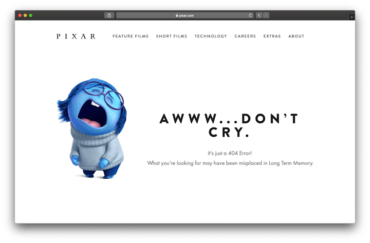
Pixar's 404 page
5."If you think good design is expensive, you should look at the cost of bad design." — Dr. Ralf Speth
Have you ever given the cost-estimate for a new project and seen a look of complete horror on your superior's face? With things like design, it can be difficult to justify cost. For those not well-versed, spending money on design may seem frivolous. After all, don't people just want something that looks nice?
Well, yes, they do, but as we've learned, good design isn't just about aesthetic appeal. Bad design doesn't just impact how easily someone can use your product; it could poorly affect your overall credibility. 75% of a website's credibility is based on the overall aesthetics. Essentially, if your site doesn't look good, customers might not trust your company, which could cost you business.
Though there are ways that bad design can actively cost you money, the way it most costs you is in opportunity cost. Research done by Forrester found that every dollar invested in UX resulted in a $100 return. Do your best to get buy-in from leadership and present the value investing in good design can bring.
Conclusion
Even without the aid of the brilliant design quotes above, it's no secret that good UX design no longer just means how attractive something is; it also comes down to how well it functions.
Make sure your products are not only beautiful but also usable. Err on the side of simplicity to improve the user experience and add in some human touches to make the experience joyful and memorable. Remember to test your designs with real people and don't skimp on the investment in design, because it will cost you in the long run.
Most of all, stay thoughtful, stay curious, and stay humble. If you do, you'll be able to create experiences that delight your users.
